Build Responsive CSS Media Queries Generate CSS media queries with feature conditions and preset breakpoints.
Media Query Generator
Generate CSS media queries with feature conditions and preset breakpoints.
Use a preset or build custom
Select a common preset or add custom conditions with media features.
Configure conditions
Set media type, feature conditions, and combine with AND or OR operators.
Copy the query
Copy the generated media query ready to use in your stylesheet.
What Is Media Query Generator?
The Media Query Generator helps you build CSS media queries for responsive design and feature detection. Media queries conditionally apply CSS rules based on device characteristics like viewport width, height, orientation, color scheme preference, and more. This tool provides preset queries for common use cases (mobile, tablet, desktop, dark mode, print, reduced motion) and a custom builder for creating complex conditions. You can set the media type (screen, print, all), add multiple feature conditions, and choose how to combine them (AND or OR). The generated query includes proper syntax with the @media rule and brackets, ready to paste into your CSS.
Why Use Media Query Generator?
-
Common presets for mobile, tablet, desktop, dark mode, and more
-
Support for all CSS media features including modern ones
-
AND/OR operators for combining multiple conditions
-
Reference table of common breakpoints for quick lookup
Common Use Cases
Responsive Layouts
Create breakpoint-based styles for different screen sizes.
Dark Mode Support
Generate prefers-color-scheme queries for dark mode styles.
Print Stylesheets
Write @media print queries for print-optimized styles.
Accessibility Features
Target reduced motion and contrast preferences for accessible designs.
Technical Guide
CSS media queries use the @media rule to conditionally apply styles. The syntax is @media [type] and (condition) { rules }. Media types include screen, print, and all. Media features test device capabilities: min-width/max-width for responsive breakpoints, orientation for landscape/portrait, prefers-color-scheme for dark/light mode, prefers-reduced-motion for animation sensitivity, hover for hover capability, and pointer for input precision. Multiple conditions are combined with and keyword for all conditions, or comma-separated for any condition. The not keyword negates a query. Modern features like prefers-color-scheme and prefers-reduced-motion enable progressive enhancement for user preferences. For mobile-first approach, use min-width queries. For desktop-first, use max-width. Combining both creates range queries like @media (min-width: 768px) and (max-width: 1023px).
Tips & Best Practices
-
1Use mobile-first approach with min-width queries for better performance
-
2Always include prefers-reduced-motion for accessibility
-
3Test prefers-color-scheme for automatic dark mode support
-
4Use range queries (min and max) for targeting specific device categories
Related Tools
CSS Flexbox Playground
Visual CSS Flexbox explorer with interactive controls for all flex container properties.
🎨 CSS & Design
CSS Grid Playground
Visual CSS Grid builder with interactive controls for template columns, rows, and gaps.
🎨 CSS & Design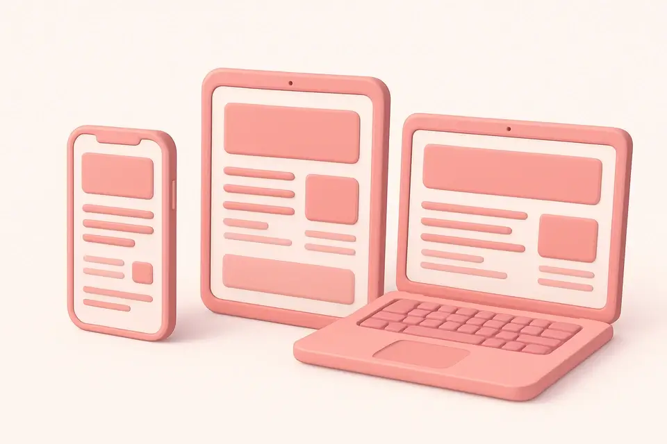

Responsive Design Tester
Preview websites at common device breakpoints with a built-in iframe viewer.
🎨 CSS & Design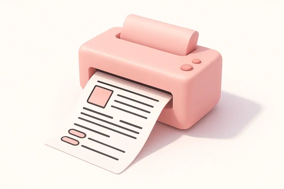
Print Stylesheet Generator
Generate @media print stylesheets with options to hide elements, style text, and control page breaks.
🎨 CSS & DesignFrequently Asked Questions
Q Should I use min-width or max-width?
Q What breakpoints should I use?
Q Can I combine multiple conditions?
Q What is prefers-color-scheme?
Q How do I support reduced motion?
About This Tool
Media Query Generator is a free online tool by FreeToolkit.ai. All processing happens directly in your browser — your data never leaves your device. No registration or installation required.