CSS Grid Playground Visual CSS Grid builder with interactive controls for template columns, rows, and gaps.

CSS Grid Playground
Visual CSS Grid builder with interactive controls for template columns, rows, and gaps.
Define grid structure
Set the number of columns and rows, or enter custom template values.
Adjust spacing and alignment
Control column and row gaps, and set justify-items and align-items.
Copy the CSS
Preview the grid layout and copy the CSS code.
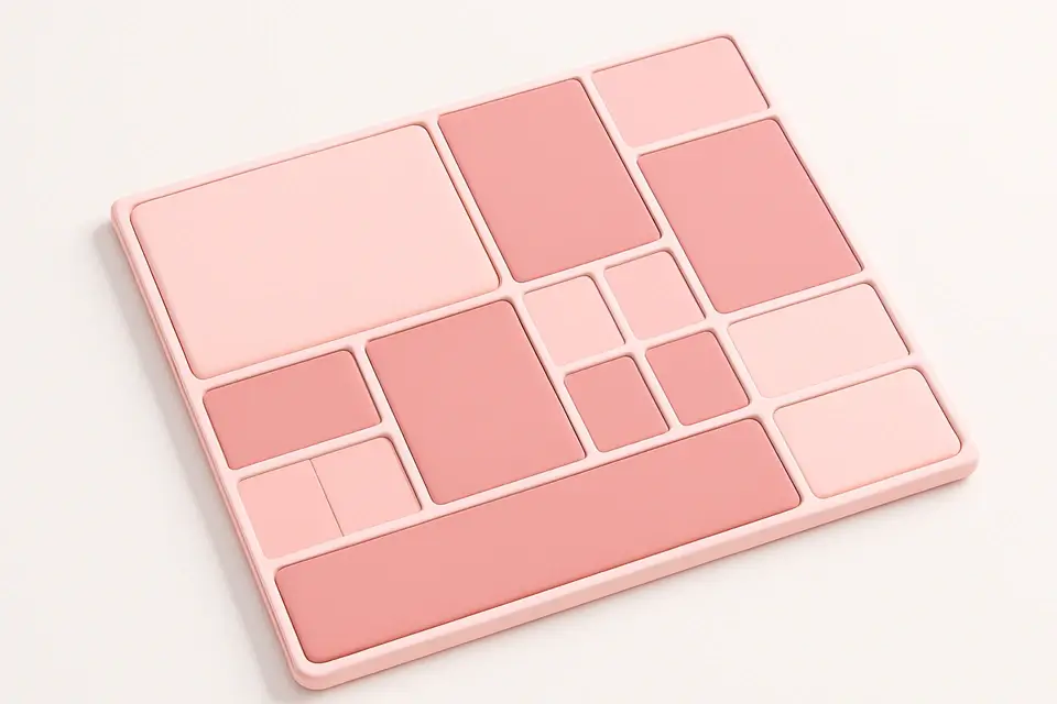
What Is CSS Grid Playground?
The CSS Grid Playground is an interactive builder for CSS Grid layouts, the most powerful layout system in CSS. Grid provides two-dimensional control over both rows and columns simultaneously, making it ideal for complex page layouts. This tool offers two modes: auto mode uses repeat(n, 1fr) for simple equal-column grids, while manual mode lets you enter custom template values like 1fr 2fr 1fr or 200px auto 200px. You can control column and row gaps independently, and set justify-items and align-items for content alignment within grid cells. The visual preview shows colored grid items so you can see exactly how your layout configuration works. This tool is excellent for both learning Grid and prototyping production layouts.
Why Use CSS Grid Playground?
-
Both automatic and custom template modes for flexibility
-
Independent column and row gap controls
-
Justify-items and align-items for cell content alignment
-
Interactive visual preview with colored grid items
Common Use Cases
Page Layouts
Design complete page layouts with header, sidebar, content, and footer.
Image Galleries
Create responsive image grid galleries with consistent spacing.
Dashboard Layouts
Build dashboard widget layouts with different sized grid areas.
Learning CSS Grid
Experiment with grid properties to understand two-dimensional layouts.
Technical Guide
CSS Grid is activated with display: grid on a container. grid-template-columns defines column tracks using length values, fr units (fractional), or functions like repeat() and minmax(). The fr unit distributes available space proportionally. grid-template-rows works the same way for row tracks. gap (or row-gap and column-gap) sets spacing between tracks. Grid items can span multiple cells using grid-column: span n and grid-row: span n. Named grid areas using grid-template-areas provide a visual way to define complex layouts. The auto-fit and auto-fill keywords in repeat() create responsive layouts without media queries: repeat(auto-fit, minmax(250px, 1fr)) creates as many columns as fit with a minimum width.
Tips & Best Practices
-
1Use fr units for flexible, proportional column sizing
-
2Combine minmax() with auto-fit for responsive layouts without media queries
-
3Use grid-template-areas for readable, named layout regions
-
4Set gap instead of margins for consistent inter-cell spacing
Related Tools


CSS Flexbox Playground
Visual CSS Flexbox explorer with interactive controls for all flex container properties.
🎨 CSS & Design
CSS Table Generator
Build beautifully styled HTML tables with customizable colors, stripes, and hover effects.
🎨 CSS & Design

CSS Columns Generator
Create multi-column text layouts with customizable column count, gap, and rule styling.
🎨 CSS & Design

Responsive Design Tester
Preview websites at common device breakpoints with a built-in iframe viewer.
🎨 CSS & DesignFrequently Asked Questions
Q What does fr mean in CSS Grid?
Q How do I make a responsive grid?
Q Can grid items overlap?
Q When should I use Grid vs Flexbox?
Q Does CSS Grid work in all browsers?
About This Tool
CSS Grid Playground is a free online tool by FreeToolkit.ai. All processing happens directly in your browser — your data never leaves your device. No registration or installation required.