Interactive CSS Flexbox Layout Playground Visual CSS Flexbox explorer with interactive controls for all flex container properties.

CSS Flexbox Playground
Visual CSS Flexbox explorer with interactive controls for all flex container properties.
Set flex container properties
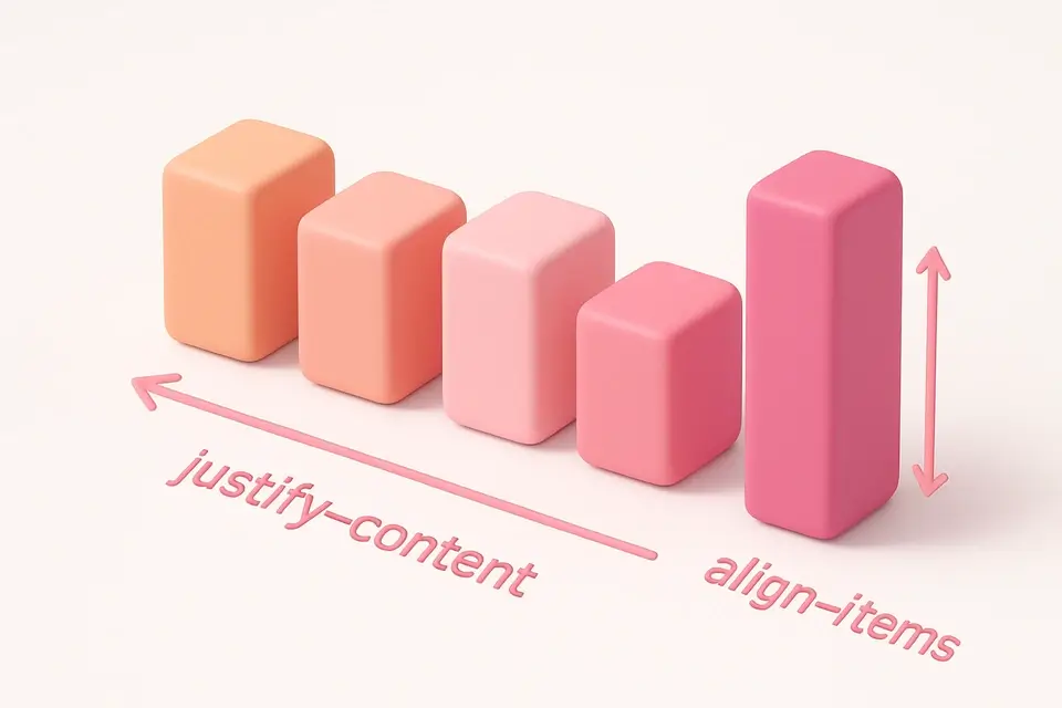
Choose flex-direction, justify-content, align-items, flex-wrap, and gap.
Adjust items
Change the number of flex items to see how the layout adapts.
Copy the CSS
Preview the layout and copy the flexbox container CSS code.
What Is CSS Flexbox Playground?
The CSS Flexbox Playground is an interactive tool for learning and experimenting with CSS Flexbox layout. Flexbox is a one-dimensional layout method for arranging items in rows or columns, providing powerful alignment and distribution controls. This playground lets you visually manipulate all flex container properties: flex-direction controls the main axis, justify-content distributes space along the main axis, align-items aligns items on the cross axis, flex-wrap controls line wrapping, and gap sets spacing between items. The preview shows colored flex items of varying heights to clearly demonstrate how each property affects the layout. You can adjust the number of items to see how the layout responds to different content amounts.
Why Use CSS Flexbox Playground?
-
Interactive controls for all flex container properties
-
Visual preview with colored items of varying heights
-
Adjustable item count to test layout flexibility
-
Clean CSS output ready for production use
Common Use Cases
Navigation Bars
Build flexible navigation layouts with centered or spaced items.
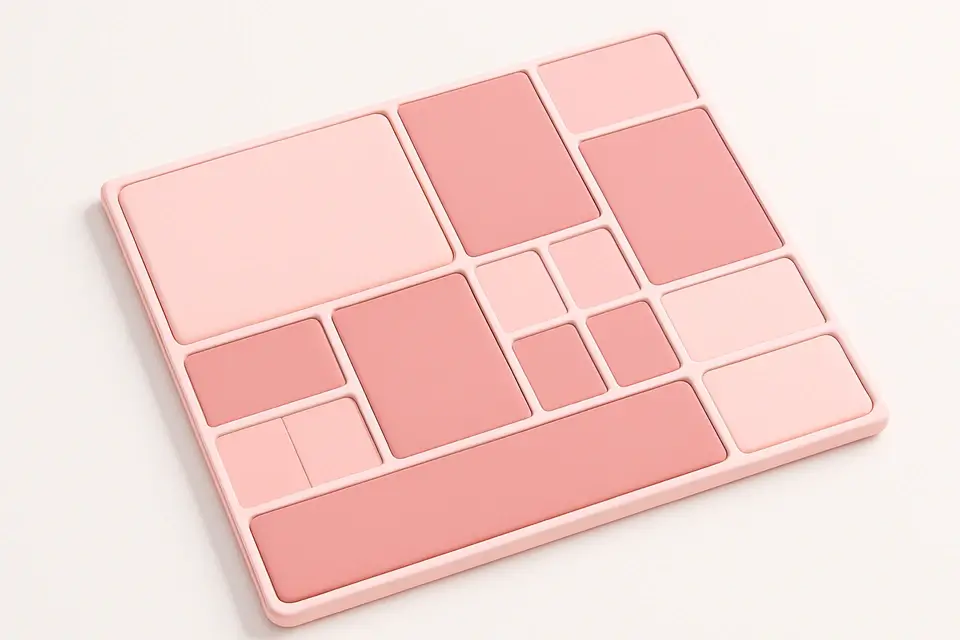
Card Grids
Create responsive card layouts that wrap and align properly.
Centering Content
Easily center elements both horizontally and vertically.
Learning Flexbox
Understand how each flexbox property affects layout through experimentation.
Technical Guide
CSS Flexbox is activated with display: flex on a container element. The flex-direction property sets the main axis: row (default, horizontal), column (vertical), and their reverse variants. justify-content distributes space on the main axis: flex-start, flex-end, center, space-between (equal space between items), space-around (equal space around items), and space-evenly. align-items aligns on the cross axis: stretch (default, fills height), flex-start, flex-end, center, and baseline. flex-wrap: wrap allows items to flow to the next line when they overflow. The gap property adds consistent spacing between items without needing margins. Flex items can use flex-grow, flex-shrink, and flex-basis to control sizing. The order property can rearrange items without changing HTML. Flexbox is ideal for one-dimensional layouts (single row or column), while CSS Grid is better for two-dimensional layouts.
Tips & Best Practices
-
1Use justify-content: center and align-items: center for perfect centering
-
2Combine flex-wrap: wrap with a min-width on items for responsive grids
-
3Use gap instead of margins for consistent spacing between items
-
4Set flex-shrink: 0 on items that should not compress below their size
Related Tools

CSS Grid Playground
Visual CSS Grid builder with interactive controls for template columns, rows, and gaps.
🎨 CSS & Design
CSS Columns Generator
Create multi-column text layouts with customizable column count, gap, and rule styling.
🎨 CSS & Design

Responsive Design Tester
Preview websites at common device breakpoints with a built-in iframe viewer.
🎨 CSS & Design

Spacing Scale Generator
Generate a consistent spacing scale system with customizable base unit and multipliers.
🎨 CSS & DesignFrequently Asked Questions
Q How do I choose between Flexbox and CSS Grid?
Q How do I center an element with Flexbox?
Q What does flex: 1 mean?
Q Can I change the order of flex items?
Q Does Flexbox work in all browsers?
About This Tool
CSS Flexbox Playground is a free online tool by FreeToolkit.ai. All processing happens directly in your browser — your data never leaves your device. No registration or installation required.