Preview Your Responsive Design on Any Device Preview websites at common device breakpoints with a built-in iframe viewer.
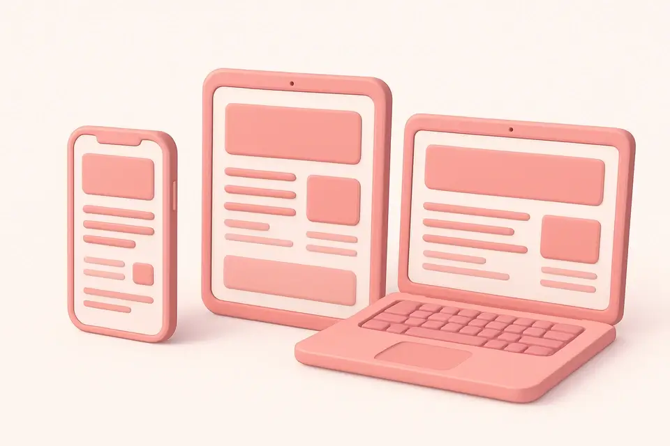
Responsive Design Tester
Preview websites at common device breakpoints with a built-in iframe viewer.
Enter a URL
Paste the website URL you want to test for responsiveness.
Select a device
Choose from preset device sizes or enter custom dimensions.
Preview and test
View the website at the selected size with adjustable zoom.
What Is Responsive Design Tester?
The Responsive Design Tester lets you preview websites at common device breakpoints using a scalable iframe viewer. Responsive design ensures websites look and function well across all screen sizes, and testing is essential. This tool provides preset device sizes for popular devices: iPhone SE, iPhone 14, iPhone 14 Pro Max, iPad Mini, iPad Pro, laptop, and desktop. You can also set custom dimensions for specific testing needs. The zoom control scales the preview to fit your screen while maintaining accurate dimensions. The tool also generates a corresponding media query for the selected breakpoint, helping you write targeted CSS for each device size.
Why Use Responsive Design Tester?
-
Preset sizes for popular iPhone, iPad, and desktop devices
-
Custom dimension support for specific testing needs
-
Adjustable zoom for comfortable viewing of any device size
-
Auto-generated media query for each breakpoint
Common Use Cases
Mobile Testing
Preview websites on iPhone and Android screen sizes without physical devices.
Breakpoint Debugging
Identify where layouts break by testing at specific pixel widths.
Client Presentations
Demonstrate responsive behavior across devices in client reviews.
QA Testing
Verify layout and content at standard breakpoints during quality assurance.
Technical Guide
The responsive tester uses a CSS-scaled iframe to simulate device viewports. The iframe is set to the actual device dimensions (e.g., 390x844 for iPhone 14), then CSS transform: scale() is applied to fit it within the visible area. The transform-origin: top left ensures proper scaling behavior. This approach provides an accurate representation of how the website renders at the target resolution. Note that this is a viewport simulation—it does not replicate device-specific rendering engines, touch behavior, or device pixel ratios. For accurate device testing, use browser developer tools or real devices. The generated media query uses max-width by default, following the mobile-first approach where you can then add min-width queries for larger screens.
Tips & Best Practices
-
1Test at multiple breakpoints, not just preset device sizes
-
2Pay attention to content between breakpoints, not just at them
-
3Check both portrait and landscape orientations for mobile devices
-
4Use the generated media queries as starting points for your CSS
Related Tools


CSS Flexbox Playground
Visual CSS Flexbox explorer with interactive controls for all flex container properties.
🎨 CSS & Design
CSS Grid Playground
Visual CSS Grid builder with interactive controls for template columns, rows, and gaps.
🎨 CSS & Design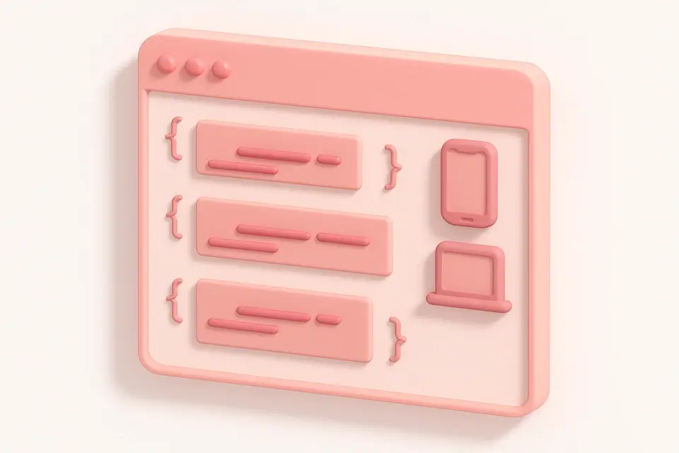

Media Query Generator
Generate CSS media queries with feature conditions and preset breakpoints.
🎨 CSS & Design
Tailwind CSS Playground
Apply Tailwind CSS utility classes to elements with live preview and HTML output.
🎨 CSS & DesignFrequently Asked Questions
Q Is this the same as testing on a real device?
Q Why does my site look different than on a real phone?
Q Can I test interactive features?
Q Does this tool simulate retina or HiDPI displays?
Q Can I test local development servers?
About This Tool
Responsive Design Tester is a free online tool by FreeToolkit.ai. All processing happens directly in your browser — your data never leaves your device. No registration or installation required.