Create a Consistent CSS Spacing Scale Generate a consistent spacing scale system with customizable base unit and multipliers.


Spacing Scale Generator
Generate a consistent spacing scale system with customizable base unit and multipliers.
Set the base unit
Choose the base spacing value in pixels (commonly 4px or 8px).
Choose the output unit
Select px or rem for the generated spacing values.
Copy CSS variables
Preview the visual scale and copy the CSS custom properties.
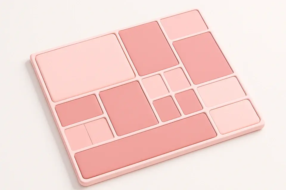
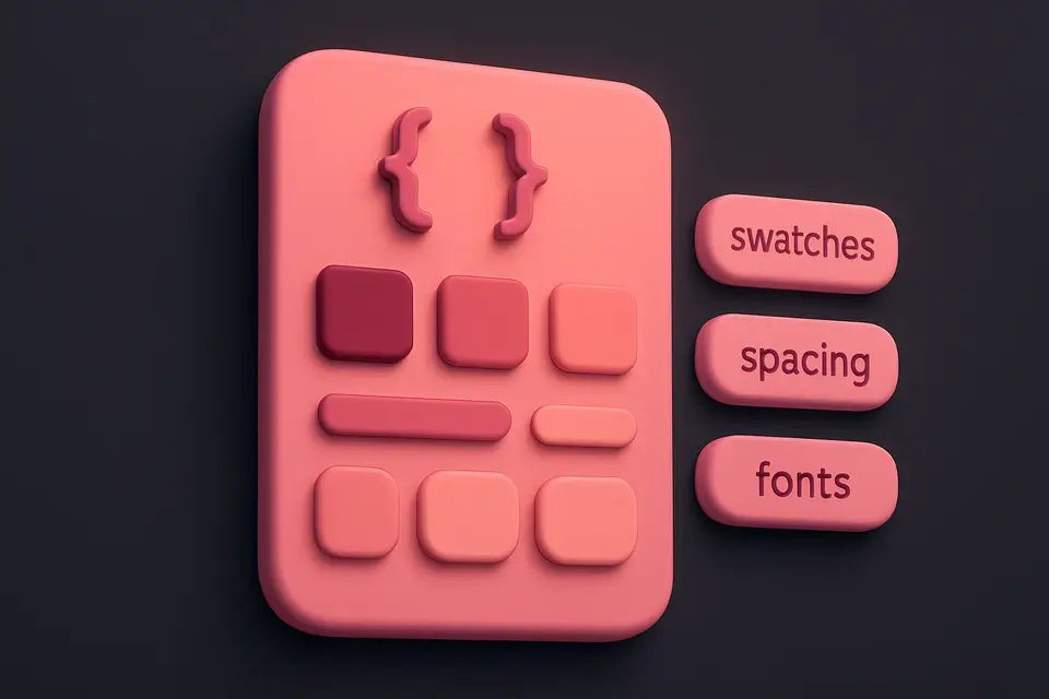
What Is Spacing Scale Generator?
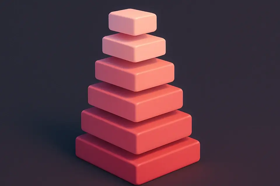
The Spacing Scale Generator creates a consistent spacing system for web design using a base unit multiplied by a predefined set of factors. Consistent spacing is critical for professional, harmonious designs—without it, layouts look inconsistent and unpolished. This tool uses a base unit (typically 4px or 8px) multiplied by factors (0, 0.5, 1, 1.5, 2, 3, 4, 5, 6, 8, 10, 12, 16, 20, 24) to generate a full spacing scale. The visual preview shows each spacing value as a colored bar, making it easy to see the relative differences. The output is a set of CSS custom properties (--space-0 through --space-24) in either px or rem, ready for use as margin, padding, gap, and other spacing values throughout your stylesheet.
Why Use Spacing Scale Generator?
-
Base unit system for mathematically consistent spacing
-
Visual bar chart showing relative spacing differences
-
CSS custom properties output for design system integration
-
Supports both px and rem output units
Common Use Cases
Design System Tokens
Generate spacing tokens as the foundation of a design system.
Component Library Spacing
Ensure consistent spacing across all components in a library.
New Project Setup
Establish a spacing system when starting new web projects.
Team Alignment
Share a standardized spacing scale across design and development teams.
Technical Guide
The most common base units are 4px (used by Tailwind CSS and Material Design) and 8px (used by many design systems). A 4px base creates fine-grained control: 4, 8, 12, 16, 20, 24, 32, 40, etc. An 8px base creates larger jumps: 8, 16, 24, 32, 40, 48, etc. CSS custom properties (variables) store the values for reuse: --space-1: 0.25rem. These can be used in margin, padding, gap, and any other spacing property. Using rem units ensures spacing scales with the root font size, maintaining proportions when users change text size. The half-step (0.5x) provides a smaller increment for fine adjustments. Large multipliers (16x, 20x, 24x) handle section spacing and large layout gaps.
Tips & Best Practices
-
1Use 4px base for fine-grained control, 8px for simpler scale
-
2Apply rem units for accessible, scalable spacing
-
3Use CSS custom properties for easy global spacing adjustments
-
4Stick to the scale values—avoid arbitrary spacing for consistency
Related Tools

CSS Grid Playground
Visual CSS Grid builder with interactive controls for template columns, rows, and gaps.
🎨 CSS & Design

Tailwind Config Generator
Generate Tailwind CSS configuration files with custom colors, fonts, and breakpoints.
🎨 CSS & Design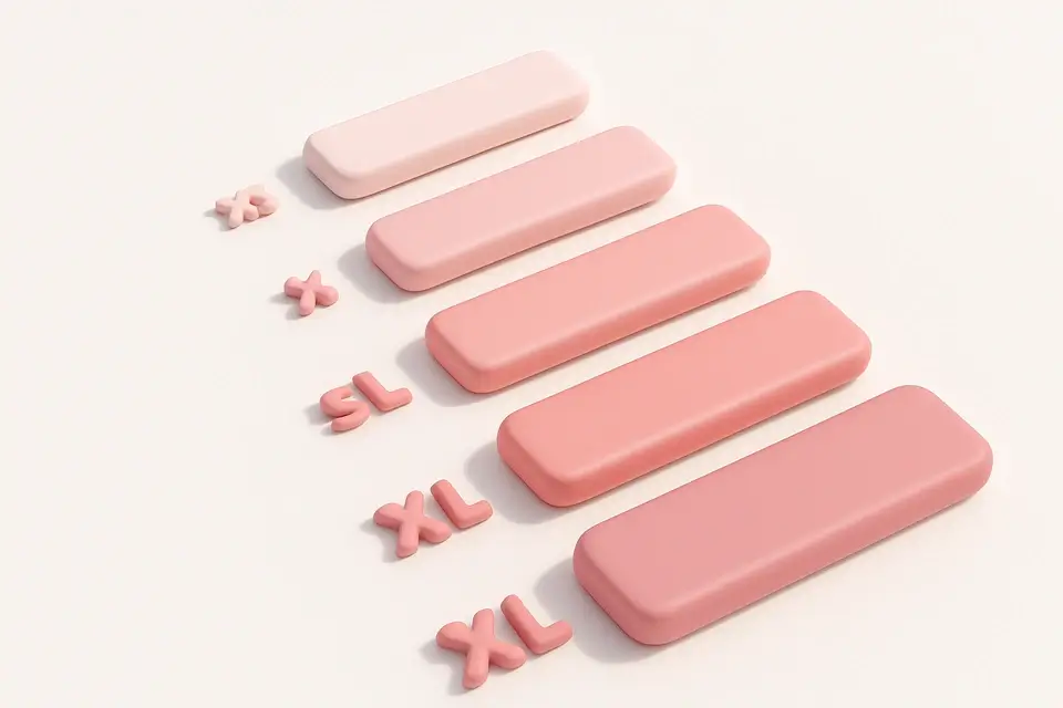
Typography Scale Generator
Generate a modular typographic scale with customizable base size, ratio, and units.
🎨 CSS & Design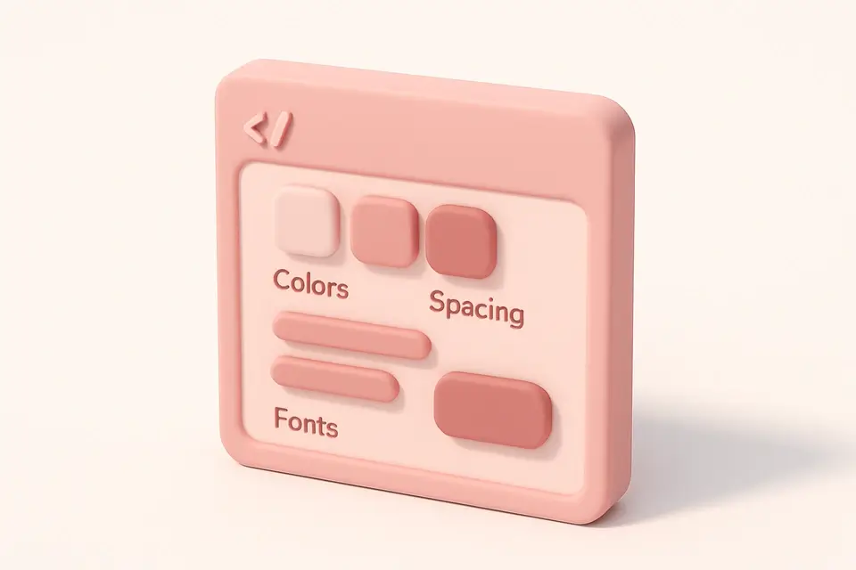
CSS Variable Generator
Generate CSS custom properties (variables) for colors, spacing, and typography.
🎨 CSS & DesignFrequently Asked Questions
Q What base size should I use?
Q Is rem or px better for CSS spacing?
Q Why not use arbitrary spacing values?
Q How do I use these spacing values?
Q Can I modify the multiplier set?
About This Tool
Spacing Scale Generator is a free online tool by FreeToolkit.ai. All processing happens directly in your browser — your data never leaves your device. No registration or installation required.