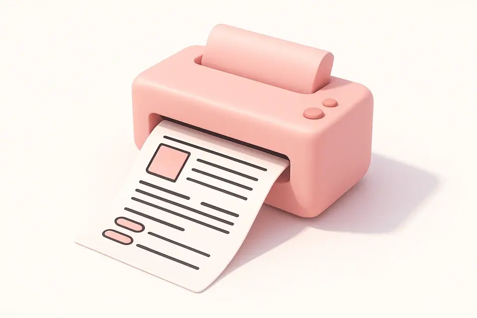
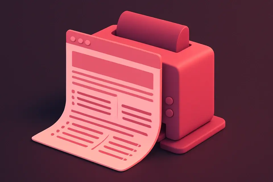
Create Print-Friendly CSS for Any Web Page Generate @media print stylesheets with options to hide elements, style text, and control page breaks.
Print Stylesheet Generator
Generate @media print stylesheets with options to hide elements, style text, and control page breaks.
Select elements to hide
Toggle which elements (nav, footer, sidebar, buttons, ads) to hide when printing.
Configure print styling
Enable black text, white background, URL display, and page break control.
Copy the CSS
Copy the complete @media print stylesheet for your project.
What Is Print Stylesheet Generator?
The Print Stylesheet Generator creates optimized @media print CSS for making web pages print-friendly. When users print web pages, many elements (navigation, ads, sidebars) are unnecessary and waste ink and paper. This tool generates a print stylesheet that hides non-essential elements, forces readable black text on white backgrounds, optionally shows URLs after links, controls page breaks around headings and images, and expands content to full width. You can toggle which elements to hide (navigation, footer, sidebar, buttons, advertisements, images), configure text styling (font size, line height), and set page margins. The generated CSS uses the @media print query, ensuring it only applies when printing.
Why Use Print Stylesheet Generator?
-
Toggle controls for hiding specific non-essential elements
-
Force black text and white background for readability and ink saving
-
Smart page break control for headings, images, and tables
-
Configurable font size, line height, and page margins
Common Use Cases
Blog Articles
Create print-friendly versions of blog posts and articles.
Documentation
Ensure technical documentation prints cleanly and completely.
Invoices and Reports
Optimize invoice and report pages for printing with proper margins.
Recipes and Guides
Make recipes and how-to guides easily printable without clutter.
Technical Guide
The @media print query applies styles only when the page is being printed. Best practices include: hiding non-essential elements (nav, footer, ads) with display: none !important; forcing color: #000 and background: #fff for readability and ink efficiency; using page-break-after: avoid on headings to keep them with their content; page-break-inside: avoid on images and tables to prevent awkward splits; showing link URLs with a[href]::after { content: " (" attr(href) ")"; }; and expanding content to width: 100% by removing fixed-width constraints. The @page at-rule controls page margins: @page { margin: 2cm; }. Use the !important declaration to override inline styles and specificity issues. Print stylesheets should be tested with the browser print preview. For responsive sites, ensure the print stylesheet overrides any media query-based layout changes. Consider using page-break-before: always for sections that should start on new pages.
Tips & Best Practices
-
1Always test print styles using browser Print Preview (Ctrl/Cmd + P)
-
2Use !important on print styles to override inline and specific styles
-
3Set appropriate page margins (1.5-2.5cm) for comfortable reading
-
4Consider hiding images to save ink unless they are essential content
Related Tools
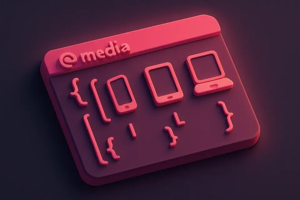
Media Query Generator
Generate CSS media queries with feature conditions and preset breakpoints.
🎨 CSS & Design

CSS Variable Generator
Generate CSS custom properties (variables) for colors, spacing, and typography.
🎨 CSS & Design

CSS Reset Viewer
View and compare popular CSS reset and normalize stylesheets.
🎨 CSS & Design
Email CSS Inliner
Inline CSS styles into HTML elements for email template compatibility.
🎨 CSS & DesignFrequently Asked Questions
Q How do I test print styles?
Q Is a separate CSS file better for print styles?
Q Why use !important in print styles?
Q How do I control page breaks?
Q Can I set different margins for different pages?
About This Tool
Print Stylesheet Generator is a free online tool by FreeToolkit.ai. All processing happens directly in your browser — your data never leaves your device. No registration or installation required.