Build Glassmorphic Card Designs with CSS Build glassmorphic card designs with backdrop blur, transparency, and shadow controls.

CSS Card Generator
Build glassmorphic card designs with backdrop blur, transparency, and shadow controls.
Set glass effect parameters
Adjust blur, opacity, and saturation to control the frosted glass appearance.
Customize borders and shadows
Fine-tune border width, opacity, radius, and shadow depth.
Copy the CSS
Preview the card on a gradient background and copy the CSS code.
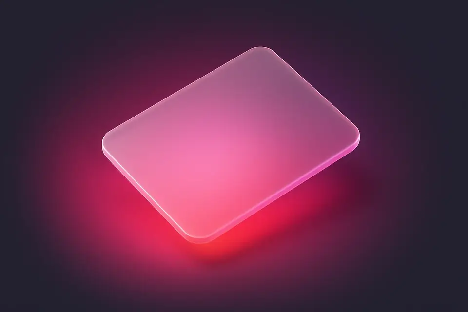
What Is CSS Card Generator?
The CSS Card Generator creates glassmorphic card designs with adjustable blur, transparency, and shadow effects. Glassmorphism is a popular UI design trend that uses background blur and semi-transparent layers to create a frosted glass effect. This tool gives you precise control over the key parameters: backdrop blur amount, background opacity, border transparency, border radius, and box shadow. The preview displays your card on a colorful gradient background so you can see exactly how the frosted glass effect looks when content shows through from behind. The generated CSS includes all necessary properties including webkit prefixes for backdrop-filter compatibility.
Why Use CSS Card Generator?
-
Complete glassmorphism controls for frosted glass card effects
-
Preview on gradient background to see transparency in action
-
Includes webkit prefixes for maximum browser compatibility
-
Adjustable shadow, border, and padding for full customization
Common Use Cases
Dashboard Widgets
Create glass-effect dashboard cards that look modern and elegant.
Feature Cards
Design feature showcase cards for landing pages with glass styling.
Overlay Content
Build frosted glass overlays for content displayed over images.
Profile Cards
Style user profile cards with a contemporary frosted glass look.
Technical Guide
Glassmorphism relies on the backdrop-filter CSS property, which applies graphical effects to the area behind an element. The key function is blur(), which creates the frosted glass appearance. Combined with a semi-transparent background (using rgba or hsla), the effect allows content behind the card to be visible but blurred. The border uses a slightly higher opacity than the background for definition. The -webkit-backdrop-filter prefix is required for Safari support. For the effect to work, the element must have a transparent or semi-transparent background, and there must be content behind it to blur. Performance consideration: backdrop-filter can be expensive on large elements or when many blurred elements overlap. Use will-change: backdrop-filter to hint the browser about the animated property. For fallback, provide a solid semi-transparent background for browsers that do not support backdrop-filter.
Tips & Best Practices
-
1Keep background opacity low (15-25%) for the best glass effect
-
2Use a colorful or image background behind the card for visible blur
-
3Add a subtle border with higher opacity than the background
-
4Combine with box-shadow for additional depth and separation
Related Tools
CSS Box Shadow Generator
Generate CSS box shadows with multiple layers, inset options, and real-time preview.
🎨 CSS & Design
CSS Border Radius Generator
Generate CSS border-radius values with per-corner control and visual preview.
🎨 CSS & Design
Glassmorphism Generator
Create frosted glass UI effects with backdrop blur, transparency, and saturation controls.
🎨 CSS & Design
Neumorphism Generator
Generate neumorphic (soft UI) designs with light and dark shadow pairs.
🎨 CSS & DesignFrequently Asked Questions
Q Does glassmorphism work in all browsers?
Q Why does my glass effect not show?
Q Is glassmorphism accessible?
Q Can I animate the blur effect?
Q What is a good blur value?
About This Tool
CSS Card Generator is a free online tool by FreeToolkit.ai. All processing happens directly in your browser — your data never leaves your device. No registration or installation required.