Create Custom CSS Box Shadows Generate CSS box shadows with multiple layers, inset options, and real-time preview.
CSS Box Shadow Generator
Generate CSS box shadows with multiple layers, inset options, and real-time preview.
Adjust shadow parameters
Use sliders to control offset, blur, spread, and color for each shadow layer.
Add multiple shadows
Click "Add Shadow" to layer multiple shadows for complex depth effects.
Copy the code
Preview the result on the box and copy the generated CSS.
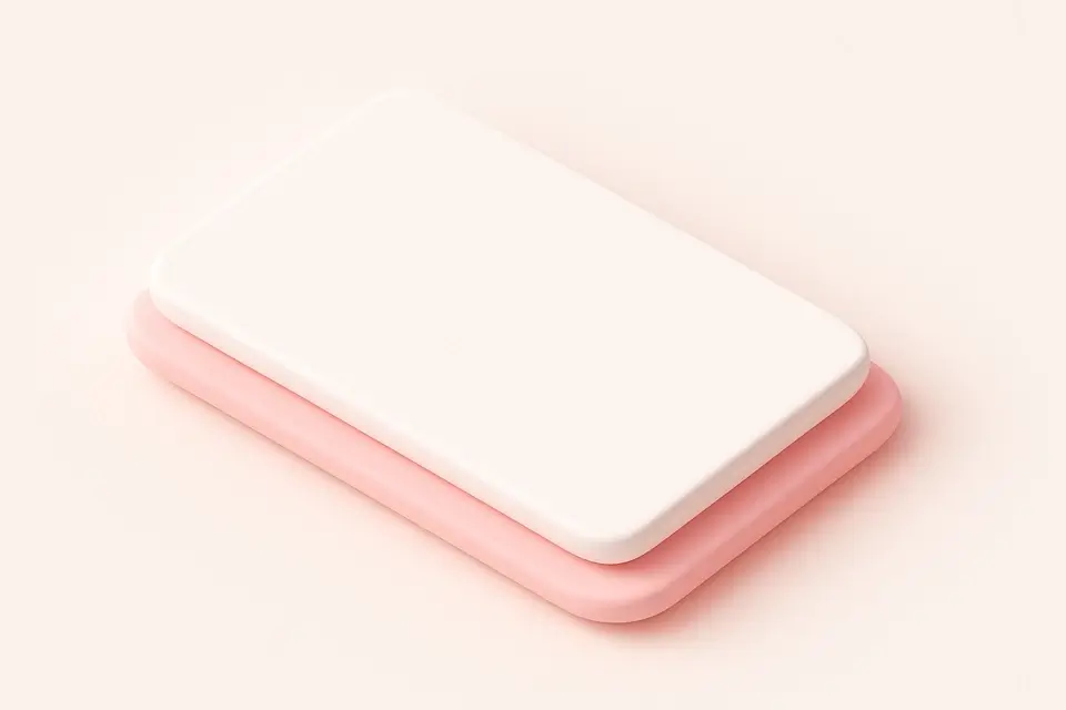
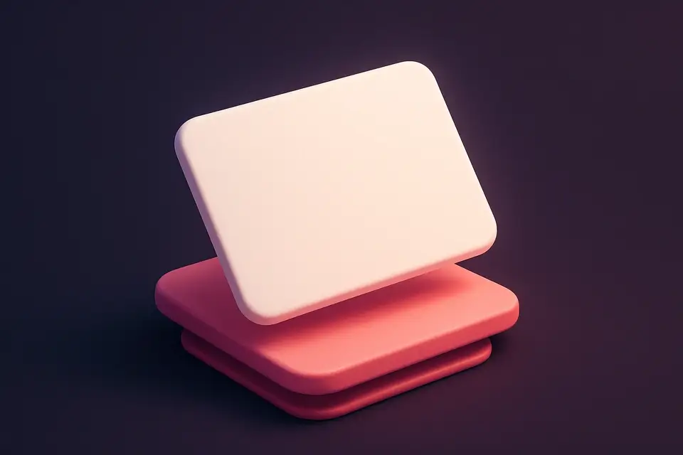
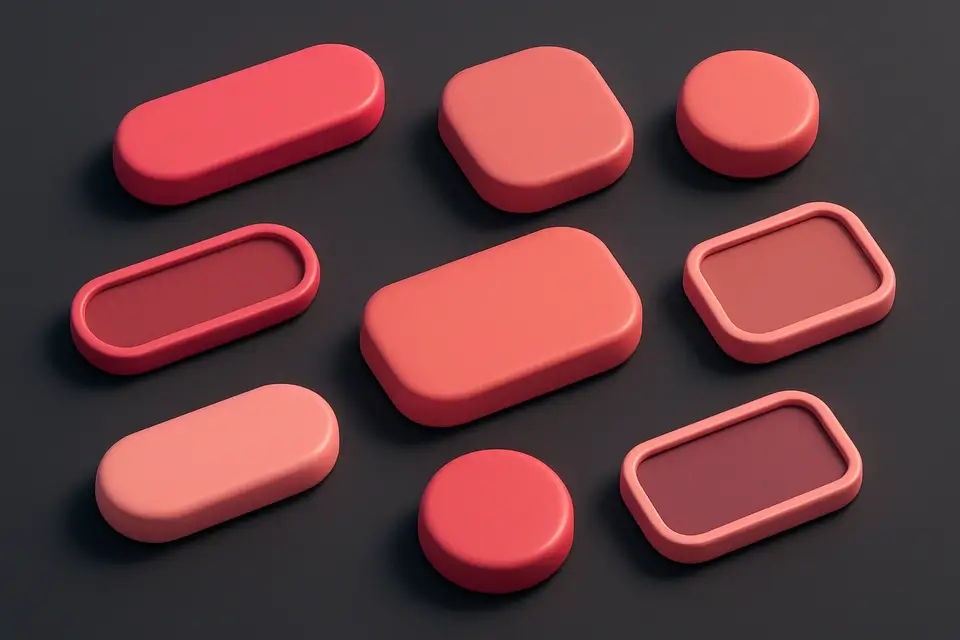
What Is CSS Box Shadow Generator?
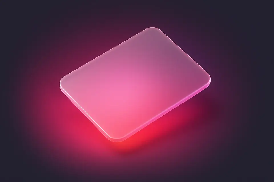
The CSS Box Shadow Generator is a visual tool for creating box-shadow effects without manually writing CSS. Box shadows add depth and dimension to HTML elements, making them appear elevated or recessed from the page surface. This tool lets you control every aspect of the shadow: horizontal and vertical offsets, blur radius, spread distance, color with opacity, and inset mode. You can stack multiple shadow layers to create realistic depth effects like material design elevation, soft floating cards, or subtle inner glows. Each shadow layer has independent controls, so you can combine a large soft shadow for depth with a small sharp shadow for definition. The live preview shows your changes instantly on a customizable box, and the generated CSS code is ready for production use.
Why Use CSS Box Shadow Generator?
-
Visual controls make it easy to create complex multi-layer shadows
-
Supports both outer and inset shadows with independent controls
-
Real-time preview on a customizable preview box
-
Generates clean CSS with multiple shadow layers properly formatted
Common Use Cases
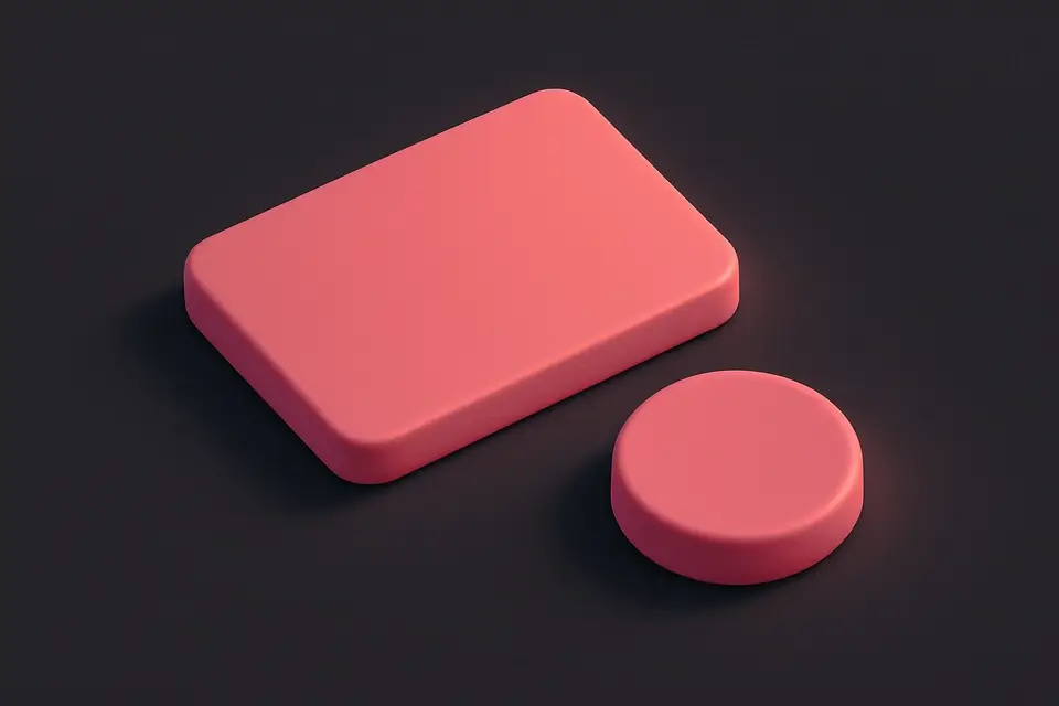
Card Elevation
Create floating card effects with layered shadows for material design.
Button Depth
Add subtle shadows to buttons to create a clickable, elevated appearance.
Modal Overlays
Design shadow effects for modals and popups to create visual separation.
Inner Glow Effects
Use inset shadows to create pressed or indented element styles.
Technical Guide
The CSS box-shadow property accepts one or more shadow values separated by commas. Each shadow value consists of: horizontal offset (x), vertical offset (y), blur radius (optional), spread radius (optional), color (optional), and the inset keyword (optional). Positive x values push the shadow right, positive y values push it down. The blur radius creates a gaussian blur effect—larger values create softer shadows. The spread radius expands or contracts the shadow; negative values create shadows smaller than the element. Multiple shadows are rendered in order—the first shadow listed appears on top. For performance, use box shadows sparingly on frequently animated elements as they can trigger expensive repaints. Consider using filter: drop-shadow() for non-rectangular shapes. Modern browsers fully support the property without vendor prefixes.
Tips & Best Practices
-
1Layer a large blurry shadow with a small sharp shadow for realistic depth
-
2Use rgba colors with low alpha for natural-looking shadows
-
3Combine inset and outer shadows for 3D button effects
-
4Keep shadow colors related to the background color for a cohesive look
Related Tools
CSS Text Shadow Generator
Create CSS text shadows with visual controls for offset, blur, color, and opacity.
🎨 CSS & Design
CSS Button Generator
Design custom CSS buttons with colors, padding, borders, shadows, and hover effects.
🎨 CSS & Design
CSS Card Generator
Build glassmorphic card designs with backdrop blur, transparency, and shadow controls.
🎨 CSS & Design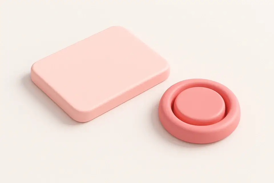
Neumorphism Generator
Generate neumorphic (soft UI) designs with light and dark shadow pairs.
🎨 CSS & DesignFrequently Asked Questions
Q Can I add multiple shadows?
Q What is an inset shadow?
Q How do I create a soft shadow?
Q Does box-shadow affect layout?
Q Can I animate box shadows?
About This Tool
CSS Box Shadow Generator is a free online tool by FreeToolkit.ai. All processing happens directly in your browser — your data never leaves your device. No registration or installation required.