Neumorphism Generator Generate neumorphic (soft UI) designs with light and dark shadow pairs.
Neumorphism Generator
Generate neumorphic (soft UI) designs with light and dark shadow pairs.
Set background color
Choose a base color—light grays work best for neumorphism.
Adjust shape and shadows
Select flat, concave, convex, or pressed shape and fine-tune distance, blur, and intensity.
Copy the CSS
Preview the neumorphic element and copy the box-shadow CSS.
What Is Neumorphism Generator?
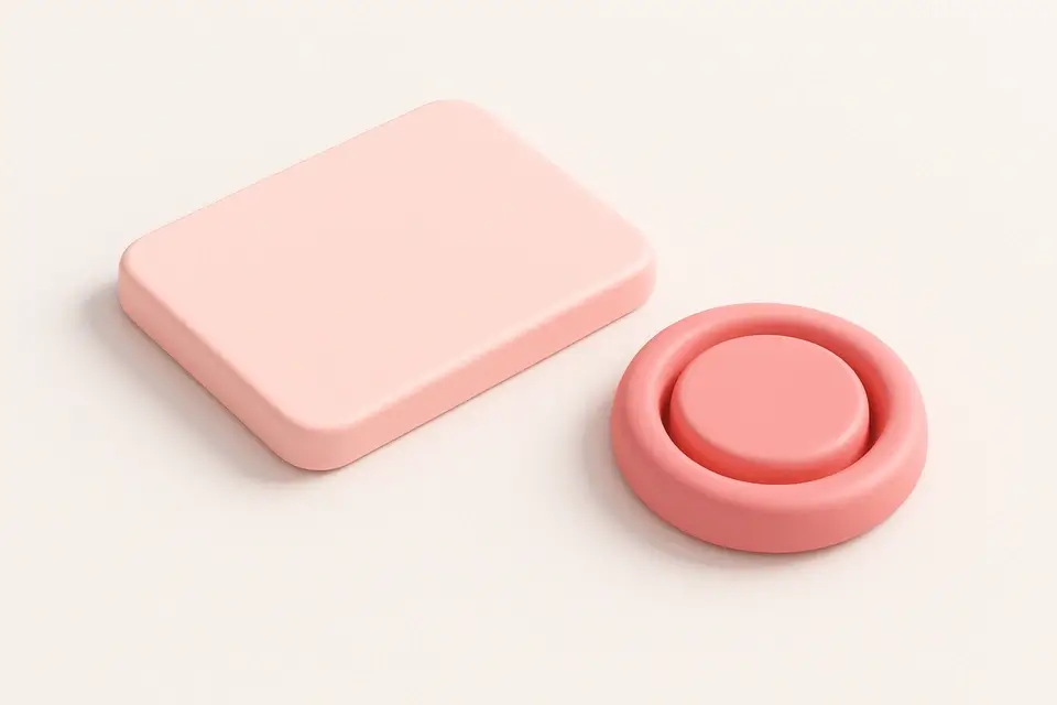
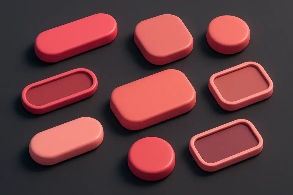
The Neumorphism Generator creates soft, extruded UI designs using carefully paired light and dark shadows. Neumorphism (also called soft UI or neomorphism) is a design trend that makes elements appear to extrude from or press into the background surface. The effect relies on two box-shadows—one light and one dark—positioned on opposite sides of the element. The background color must match the page background for the illusion to work. This tool supports four shape variants: flat (standard extrusion), concave (inward curve), convex (outward curve), and pressed (pushed into surface). Controls include shadow distance, blur radius, intensity, border radius, and background color. The automatically calculated light and dark shadow colors ensure a cohesive look.
Why Use Neumorphism Generator?
-
Four shape variants: flat, concave, convex, and pressed
-
Automatic light and dark shadow color calculation
-
Adjustable distance, blur, intensity, and border radius
-
Preview on matching background for authentic neumorphic appearance
Common Use Cases
Dashboard Controls
Create soft, tactile controls for dashboard interfaces.
Calculator Buttons
Design neumorphic calculator buttons with pressed states.
Toggle Switches
Build soft UI toggle switches and radio buttons.
Music Players
Style music player controls with a physical, tactile feel.
Technical Guide
Neumorphism uses two box-shadow values: a light shadow (highlights) offset toward the top-left and a dark shadow offset toward the bottom-right, creating the illusion of a light source from the top-left. The shadow colors are derived from the background color—the dark shadow is the background darkened, and the light shadow is the background lightened. For the concave variant, a linear gradient from darker to lighter values creates an inward curve. For convex, the gradient is reversed. The pressed variant uses inset shadows to create a depressed appearance. Intensity controls how much the shadow colors differ from the background. Blur radius affects the softness—higher values create smoother transitions. Common background colors for neumorphism are light grays (#e0e5ec, #dde1e7) as they provide the best contrast for both light and dark shadows.
Tips & Best Practices
-
1Use light gray backgrounds (#e0e5ec) for the most effective neumorphic look
-
2Keep shadow distance and blur proportional for natural appearance
-
3Avoid using neumorphism on dark backgrounds—it works best with light colors
-
4Test pressed states for interactive elements like buttons and toggles
Related Tools
CSS Box Shadow Generator
Generate CSS box shadows with multiple layers, inset options, and real-time preview.
🎨 CSS & Design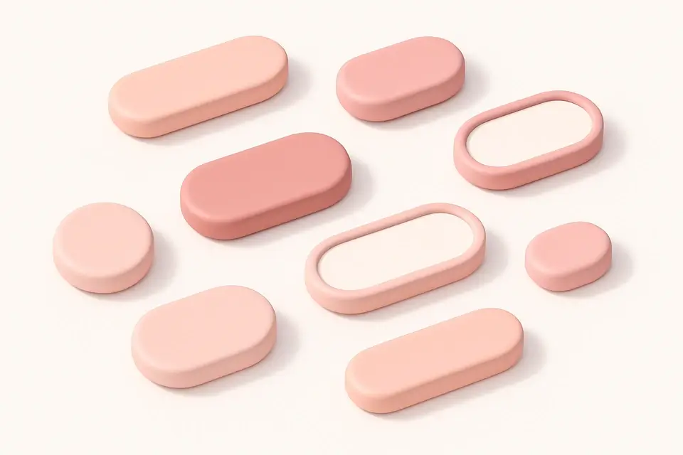
CSS Button Generator
Design custom CSS buttons with colors, padding, borders, shadows, and hover effects.
🎨 CSS & Design
Glassmorphism Generator
Create frosted glass UI effects with backdrop blur, transparency, and saturation controls.
🎨 CSS & Design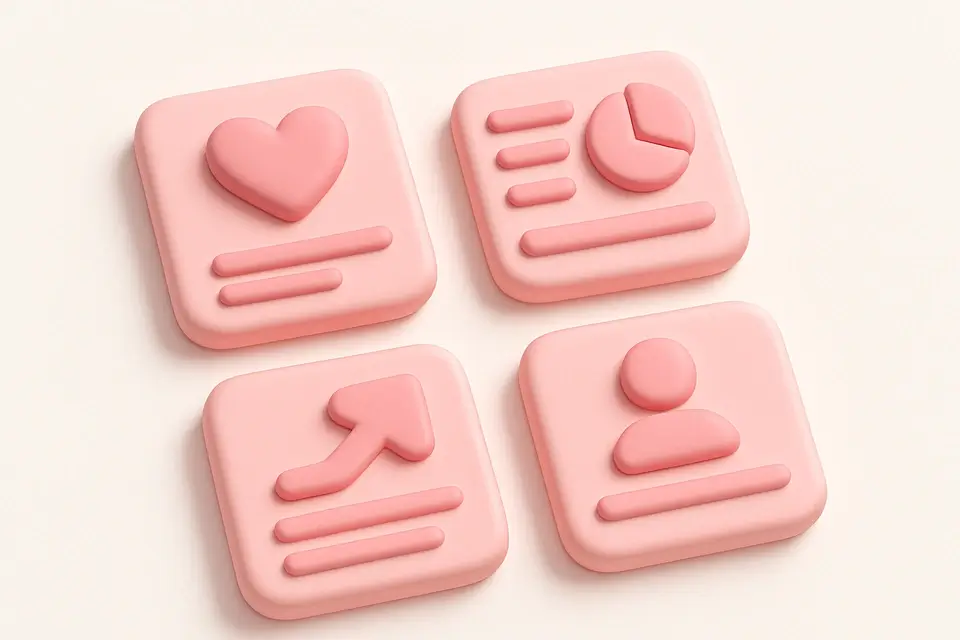

Claymorphism Generator
Create clay-like 3D UI effects with rounded corners, inner shadows, and soft highlights.
🎨 CSS & DesignFrequently Asked Questions
Q Why do my neumorphic shadows look wrong?
Q Does neumorphism work on dark backgrounds?
Q Is neumorphism accessible?
Q Can I use neumorphism for form inputs?
Q How do I create a neumorphic button pressed state?
About This Tool
Neumorphism Generator is a free online tool by FreeToolkit.ai. All processing happens directly in your browser — your data never leaves your device. No registration or installation required.