CSS Border Radius Generator with Live Preview Generate CSS border-radius values with per-corner control and visual preview.
CSS Border Radius Generator
Generate CSS border-radius values with per-corner control and visual preview.
Choose linked or individual corners
Toggle between controlling all corners together or independently.
Adjust the radius
Use sliders to set the border-radius value for each corner.
Copy the CSS
Preview the shape and copy the generated CSS border-radius property.
What Is CSS Border Radius Generator?
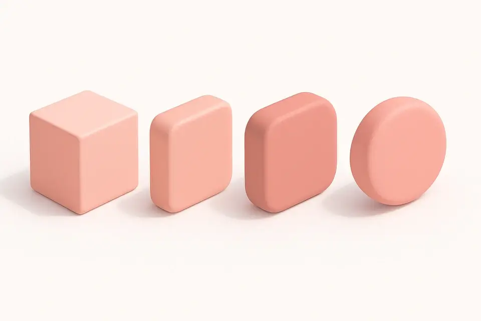
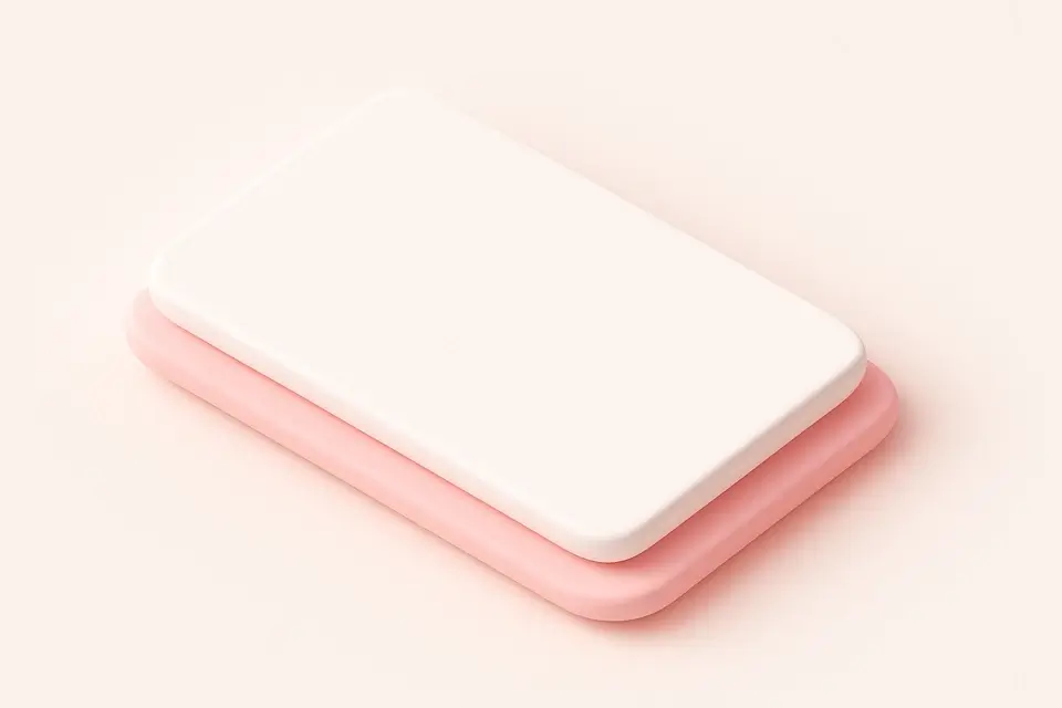
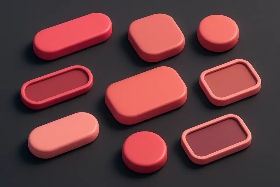
The CSS Border Radius Generator provides visual control over the border-radius property, allowing you to create rounded corners for any HTML element. You can link all corners for uniform rounding or control each corner independently for unique shapes. The tool offers a live preview that updates as you adjust the sliders, showing exactly how your element will look. You can also customize the preview box size and background color. This CSS property is one of the most commonly used in modern web design, essential for creating rounded buttons, cards, avatars, and other UI elements. The shorthand property accepts one to four values for uniform or per-corner rounding, and this tool handles both cases with a simple toggle.
Why Use CSS Border Radius Generator?
-
Per-corner control or linked uniform rounding with a simple toggle
-
Live visual preview with customizable box size and color
-
Generates both shorthand and longhand CSS as needed
-
Perfect for creating circles, pills, and custom rounded shapes
Common Use Cases
Rounded Cards
Create consistently rounded card components for dashboard and content layouts.
Pill-Shaped Buttons
Design pill or capsule-shaped buttons with high border-radius values.
Circular Avatars
Produce perfect circles for user avatars by setting radius to 50%.
Asymmetric Shapes
Craft unique shapes with different radius values on each corner.
Technical Guide
The CSS border-radius property is shorthand for four individual properties: border-top-left-radius, border-top-right-radius, border-bottom-right-radius, and border-bottom-left-radius. It accepts one to four values in clockwise order starting from the top-left corner. A single value applies to all corners. Two values set top-left/bottom-right and top-right/bottom-left. Three values set top-left, top-right/bottom-left, and bottom-right. Four values set each corner individually. Values can be in pixels, percentages, or other CSS length units. Setting border-radius to 50% on a square element creates a perfect circle. The property can also accept two sets of values separated by a slash (/) for elliptical corners, where the first set defines horizontal radii and the second defines vertical radii. This property applies to elements with visible borders, backgrounds, or outlines.
Tips & Best Practices
-
1Use 50% to create a perfect circle on a square element
-
2Large values (9999px) create pill-shaped elements regardless of size
-
3Combine different corner values for unique, organic shapes
-
4Use percentages for responsive border-radius that scales with the element
Related Tools
CSS Box Shadow Generator
Generate CSS box shadows with multiple layers, inset options, and real-time preview.
🎨 CSS & Design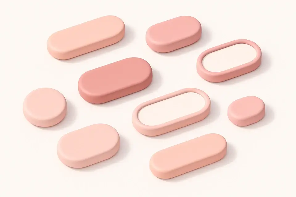
CSS Button Generator
Design custom CSS buttons with colors, padding, borders, shadows, and hover effects.
🎨 CSS & Design

CSS Card Generator
Build glassmorphic card designs with backdrop blur, transparency, and shadow controls.
🎨 CSS & Design

CSS Clip Path Generator
Create CSS clip-path shapes with polygon, circle, and ellipse presets.
🎨 CSS & DesignFrequently Asked Questions
Q How do I create a perfect circle?
Q Can I set different values for each corner?
Q What is the maximum border-radius value?
Q Does border-radius affect content clipping?
Q Can I use percentages instead of pixels?
About This Tool
CSS Border Radius Generator is a free online tool by FreeToolkit.ai. All processing happens directly in your browser — your data never leaves your device. No registration or installation required.