Build Aspect Ratio Boxes with CSS Generate responsive aspect ratio boxes with modern and legacy CSS approaches.
Aspect Ratio Box Generator
Generate responsive aspect ratio boxes with modern and legacy CSS approaches.
Select a preset or custom ratio
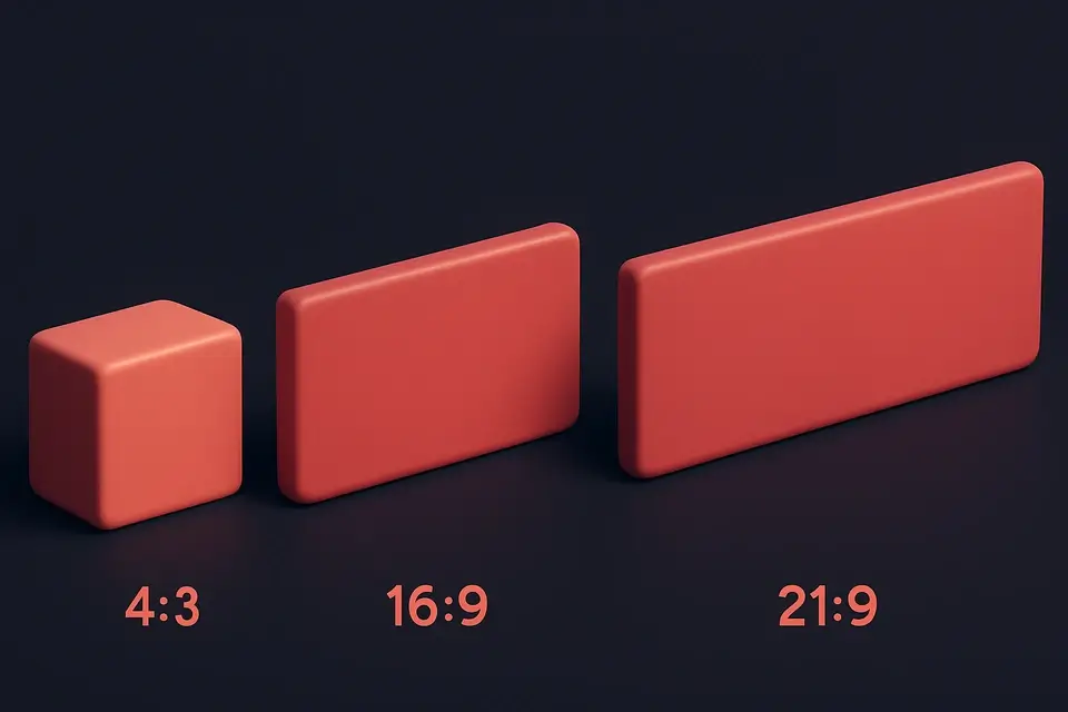
Choose from common aspect ratios (16:9, 4:3, 1:1) or enter custom values.
Configure the box
Set max-width, background color, and choose between modern or legacy CSS approach.
Copy the CSS
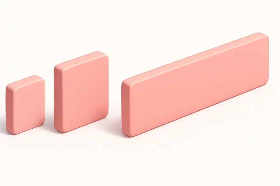
Preview the aspect ratio box and copy the CSS code.
What Is Aspect Ratio Box Generator?
The Aspect Ratio Box Generator creates responsive containers that maintain a specific width-to-height ratio regardless of their size. Maintaining aspect ratios is essential for videos, images, cards, and any element that needs proportional dimensions. This tool offers eight common presets: 1:1 (square), 4:3 (standard), 16:9 (widescreen), 21:9 (ultrawide), 3:2 (photo), 9:16 (portrait), 2:3 (poster), and 3:4 (tablet). You can also set custom ratio values. The tool supports both the modern CSS aspect-ratio property and the legacy padding-bottom technique for broader browser support. The preview shows the aspect ratio box with customizable max-width and background color, and the generated CSS includes the chosen approach.
Why Use Aspect Ratio Box Generator?
-
Eight common aspect ratio presets plus custom input
-
Both modern (aspect-ratio) and legacy (padding-bottom) CSS approaches
-
Customizable max-width and background color
-
Preview accurately shows the proportional box
Common Use Cases
Video Containers
Create 16:9 responsive containers for embedded videos.
Image Placeholders
Reserve space for images while they load to prevent layout shifts.
Responsive Cards
Maintain consistent card proportions across different screen sizes.
Photo Galleries
Build uniform image containers for gallery grid layouts.
Technical Guide
The modern CSS aspect-ratio property directly sets the preferred aspect ratio: aspect-ratio: 16 / 9. The browser automatically calculates the height based on the element width. This is supported in all modern browsers since 2021. The legacy technique uses padding-bottom as a percentage of the width (since padding percentages are relative to the parent width): padding-bottom: 56.25% creates a 16:9 ratio (9/16 * 100 = 56.25%). The legacy approach requires position: relative on the container and position: absolute; top: 0; left: 0; width: 100%; height: 100% on the child content. The modern approach is simpler and more readable. Both methods create responsive containers that maintain their ratio at any width. The max-width property limits the container size. For images, the object-fit property controls how the image fills the aspect ratio container.
Tips & Best Practices
-
1Use the modern aspect-ratio property for cleaner, simpler code
-
2Fall back to padding-bottom technique for older browser support
-
3Use object-fit: cover on images inside aspect ratio containers
-
4Set max-width to prevent the box from becoming too large on wide screens
Related Tools
CSS Flexbox Playground
Visual CSS Flexbox explorer with interactive controls for all flex container properties.
🎨 CSS & Design
CSS Grid Playground
Visual CSS Grid builder with interactive controls for template columns, rows, and gaps.
🎨 CSS & Design

Responsive Design Tester
Preview websites at common device breakpoints with a built-in iframe viewer.
🎨 CSS & Design
Media Query Generator
Generate CSS media queries with feature conditions and preset breakpoints.
🎨 CSS & DesignFrequently Asked Questions
Q What is aspect-ratio in CSS?
Q Is the aspect-ratio property supported everywhere?
Q What is the padding-bottom trick?
Q How do I put content inside an aspect ratio box?
Q Can I use aspect-ratio with images?
About This Tool
Aspect Ratio Box Generator is a free online tool by FreeToolkit.ai. All processing happens directly in your browser — your data never leaves your device. No registration or installation required.