Build Custom CSS Keyframe Animations Create CSS keyframe animations with preset effects and customizable timing.

CSS Animation Generator
Create CSS keyframe animations with preset effects and customizable timing.
Choose an animation preset
Select from bounce, fade, slide, spin, shake, pulse, or flip animations.
Customize timing
Adjust duration, timing function, delay, iteration count, and direction.
Copy the CSS
Preview the animated element and copy the keyframes and animation CSS.
What Is CSS Animation Generator?
The CSS Animation Generator helps you create keyframe-based CSS animations with a library of preset effects and full timing customization. CSS animations bring web pages to life by moving, transforming, and transitioning elements over time. This tool provides seven popular animation presets: bounce, fade, slide, spin, shake, pulse, and flip—each with properly defined @keyframes. You can customize every aspect of the animation: duration controls how long each cycle takes, timing function sets the speed curve, delay adds a pause before starting, iteration count determines how many times it plays, direction controls playback order, and fill mode defines the element state before and after the animation. The live preview shows the animation in action.
Why Use CSS Animation Generator?
-
Seven popular animation presets ready to use
-
Full control over duration, timing, delay, and iteration
-
Animation direction and fill mode controls
-
Generated CSS includes complete @keyframes definitions
Common Use Cases
Entrance Animations
Animate elements as they enter the viewport for engaging user experiences.
Loading Indicators
Create animated loading states with pulse, spin, or bounce effects.
Attention-Seeking
Use shake or pulse to draw attention to important elements.
Page Transitions
Add slide and fade animations for smooth page or section transitions.
Technical Guide
CSS animations use the animation shorthand property with @keyframes rules. The animation property combines: animation-name (references the @keyframes rule), animation-duration, animation-timing-function (ease, linear, ease-in, ease-out, ease-in-out, or custom cubic-bezier), animation-delay, animation-iteration-count (number or infinite), animation-direction (normal, reverse, alternate, alternate-reverse), animation-fill-mode (none, forwards, backwards, both), and animation-play-state (running, paused). The @keyframes rule defines the animation stages using percentages (0% to 100%) or from/to keywords. For performance, animate only transform and opacity properties when possible, as these can be GPU-accelerated. Other properties like width, height, margin, and padding trigger layout recalculations. Use the will-change property to hint the browser about upcoming animations.
Tips & Best Practices
-
1Use animation-fill-mode: both to maintain the final state after animation ends
-
2Animate only transform and opacity for GPU-accelerated performance
-
3Add prefers-reduced-motion media query for accessibility
-
4Use alternate direction for natural back-and-forth animations
Related Tools

CSS Spinner Generator
Generate CSS loading spinners and animated loaders with customizable styles.
🎨 CSS & Design
CSS Transform Playground
Experiment with CSS transforms including rotate, scale, skew, and translate with 3D perspective.
🎨 CSS & Design
CSS Transition Generator
Generate CSS transitions with customizable property, duration, easing, and hover effects.
🎨 CSS & Design
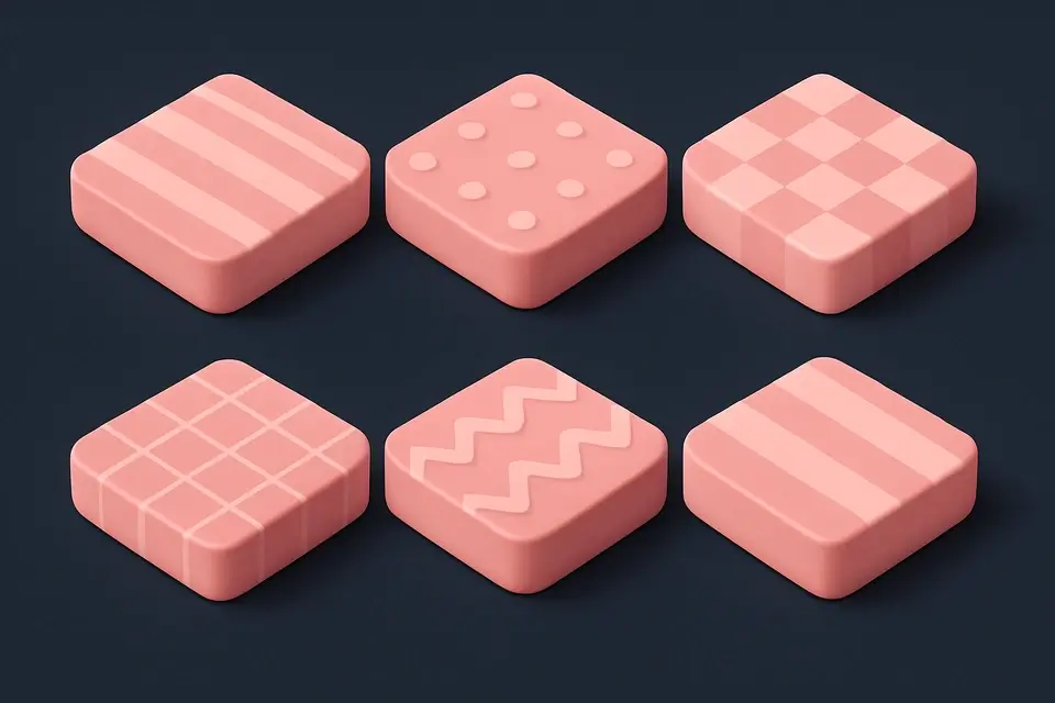
CSS Background Pattern
Create repeating CSS background patterns including stripes, checkerboard, dots, and more.
🎨 CSS & DesignFrequently Asked Questions
Q What is the difference between animation and transition?
Q Can I chain multiple animations?
Q How do I pause an animation?
Q What does animation-fill-mode do?
Q Are CSS animations accessible?
About This Tool
CSS Animation Generator is a free online tool by FreeToolkit.ai. All processing happens directly in your browser — your data never leaves your device. No registration or installation required.