CSS Transform Playground Experiment with CSS transforms including rotate, scale, skew, and translate with 3D perspective.
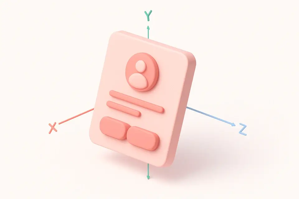
CSS Transform Playground
Experiment with CSS transforms including rotate, scale, skew, and translate with 3D perspective.
Adjust transform values
Use sliders for translate, rotate (X, Y, Z), scale, and skew parameters.
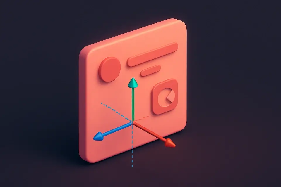
Preview with perspective
See the 3D transform effect with adjustable perspective depth.
Copy the CSS
Copy the generated transform and perspective CSS properties.
What Is CSS Transform Playground?
The CSS Transform Playground is an interactive tool for experimenting with CSS transform functions including translate, rotate (X, Y, Z axes), scale, skew, and 3D perspective. CSS transforms allow you to move, rotate, scale, and distort elements without affecting the document flow. This playground provides real-time visual feedback as you adjust parameters, making it easy to understand how each transform function works and how they combine. The perspective control adds 3D depth to rotation effects, creating realistic card-flip and tilt animations. A reset button restores all values for quick experimentation.
Why Use CSS Transform Playground?
-
Interactive sliders for all transform functions including 3D rotation
-
Adjustable perspective for realistic 3D depth effects
-
Real-time visual preview with smooth transitions
-
One-click reset for quick experimentation cycles
Common Use Cases
Animation Prototyping
Experiment with transform values before implementing CSS animations.
Card Flip Effects
Design 3D card flip interactions using rotateY and perspective.
Hover Interactions
Create scale and rotate hover effects for interactive elements.
Learning CSS Transforms
Understand how each transform function affects element rendering.
Technical Guide
The CSS transform property accepts one or more transform functions applied in order (right to left in the transform chain). translate(x, y) moves an element, rotate(angle) rotates it, scale(x, y) resizes it, and skew(x, y) distorts it. For 3D transforms, rotateX(), rotateY(), and rotateZ() rotate around specific axes. The perspective property on the parent element or perspective() function within transform creates 3D depth—smaller values create more dramatic perspective effects. Transform-origin (default center) sets the point around which transforms are applied. Transforms create a new stacking context and do not affect layout flow—other elements are not displaced. For performance, transforms using translate3d() or will-change: transform are GPU-accelerated, making them ideal for animations.
Tips & Best Practices
-
1Use transform: translateZ(0) to force GPU acceleration
-
2Set perspective on the parent element for consistent 3D effects across children
-
3Combine rotate and translate for orbit animations
-
4Transform-origin changes the pivot point—try corner origins for creative effects
Related Tools


CSS Filter Generator
Apply CSS filter effects like blur, brightness, contrast, and more with visual controls.
🎨 CSS & Design

CSS Animation Generator
Create CSS keyframe animations with preset effects and customizable timing.
🎨 CSS & Design

CSS Transition Generator
Generate CSS transitions with customizable property, duration, easing, and hover effects.
🎨 CSS & Design
Neumorphism Generator
Generate neumorphic (soft UI) designs with light and dark shadow pairs.
🎨 CSS & DesignFrequently Asked Questions
Q Does transform order matter?
Q Do transforms affect layout?
Q What is perspective in CSS?
Q Can transforms be animated?
Q What is transform-origin?
About This Tool
CSS Transform Playground is a free online tool by FreeToolkit.ai. All processing happens directly in your browser — your data never leaves your device. No registration or installation required.