Create Custom CSS Loading Spinners Generate CSS loading spinners and animated loaders with customizable styles.

CSS Spinner Generator
Generate CSS loading spinners and animated loaders with customizable styles.
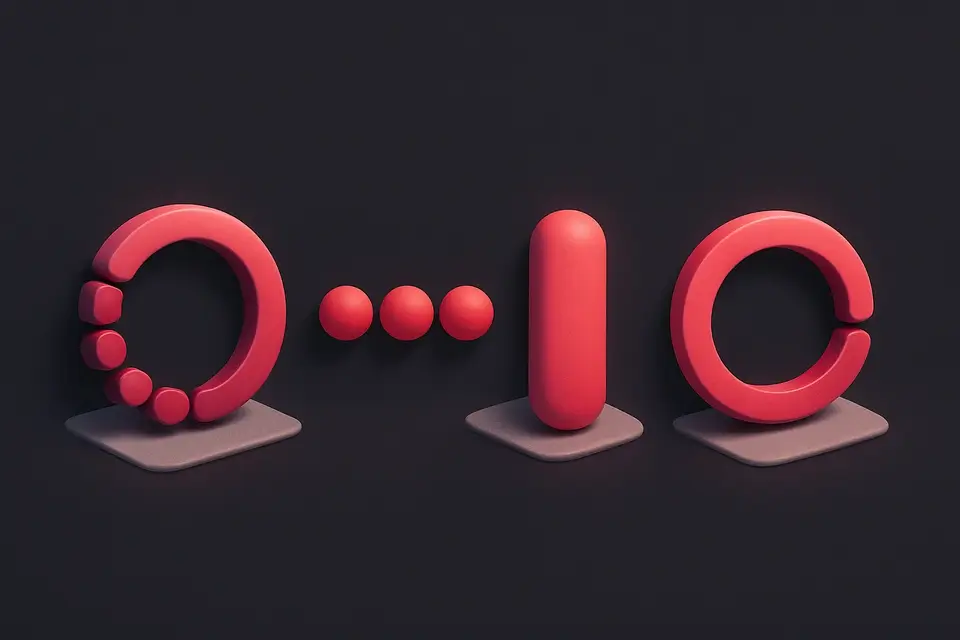
Choose spinner type
Select from border, dots, pulse, or ring spinner styles.
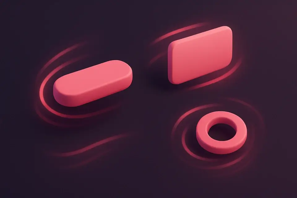
Customize appearance
Adjust color, size, border width, and animation speed.
Copy the code
Preview the animated spinner and copy the HTML and CSS code.
What Is CSS Spinner Generator?
The CSS Spinner Generator creates animated loading indicators using pure CSS. Loading spinners provide visual feedback to users during asynchronous operations like data fetching, file uploads, or page transitions. This tool offers four distinct spinner styles: border spinner (classic rotating circle), dots (bouncing dots), pulse (expanding circle), and ring (rotating ring). Each style is fully customizable with controls for color, size, border width, and animation speed. The generated code includes both the HTML markup and the CSS with @keyframes animation definitions. All spinners are lightweight, performant, and require no JavaScript or external libraries. They work across all modern browsers and are easily integrated into any web project.
Why Use CSS Spinner Generator?
Common Use Cases
Data Loading States
Show spinners while fetching data from APIs or databases.
Form Submission Feedback
Display a spinner on submit buttons during form processing.
Page Transitions
Use spinners during page navigation or route changes in SPAs.
Content Lazy Loading
Add loading indicators while images or components load.
Technical Guide
CSS spinners use @keyframes animations to create continuous motion. The border spinner technique uses a circular element with a transparent border on most sides and a colored border on one side, then rotates it 360 degrees. The dots animation uses scale transforms to create a bouncing effect with staggered animation-delay. The pulse animation scales an element from 0 to 1 while fading opacity. All animations use animation: name duration timing-function iteration-count. Setting iteration-count to infinite ensures continuous looping. The animation-timing-function (ease, linear, ease-in-out) controls the speed curve. For accessibility, add role="status" and an aria-label to spinners. Consider using prefers-reduced-motion media query to disable or reduce animations for users who prefer reduced motion.
Tips & Best Practices
-
1Use animation-timing-function: linear for smooth, constant rotation
-
2Add prefers-reduced-motion media query for accessibility
-
3Keep spinner size appropriate—48px is standard, 24px for inline
-
4Use aria-label="Loading" for screen reader accessibility
Related Tools
CSS Transform Playground
Experiment with CSS transforms including rotate, scale, skew, and translate with 3D perspective.
🎨 CSS & Design
CSS Animation Generator
Create CSS keyframe animations with preset effects and customizable timing.
🎨 CSS & Design

CSS Transition Generator
Generate CSS transitions with customizable property, duration, easing, and hover effects.
🎨 CSS & Design
CSS Reset Viewer
View and compare popular CSS reset and normalize stylesheets.
🎨 CSS & DesignFrequently Asked Questions
Q Are CSS spinners accessible?
Q Can I change the rotation direction?
Q How do I center the spinner on the page?
Q Will CSS spinners work in older browsers?
Q How do I change the animation speed?
About This Tool
CSS Spinner Generator is a free online tool by FreeToolkit.ai. All processing happens directly in your browser — your data never leaves your device. No registration or installation required.