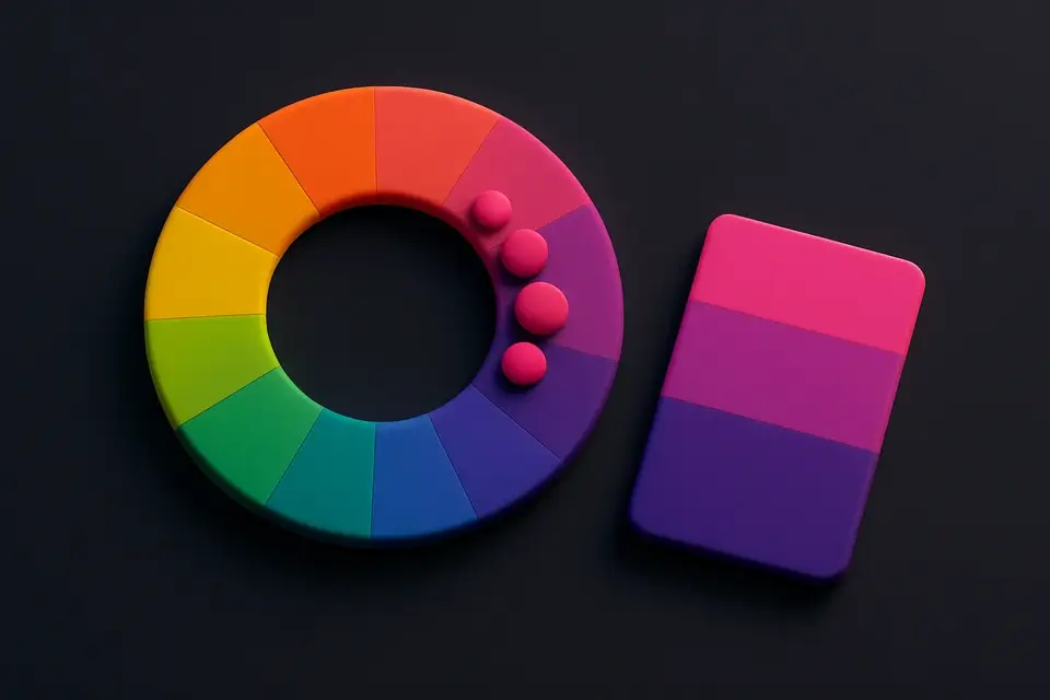
Complementary Color Generator Generate complementary color pairs with light and dark variations.
Complementary Color Generator
Generate complementary color pairs with light and dark variations.
Choose Base Color
Pick your starting color with the color picker.
View Complement
See the complementary color plus light/dark variations.
Copy Colors
Copy individual colors or the full palette.
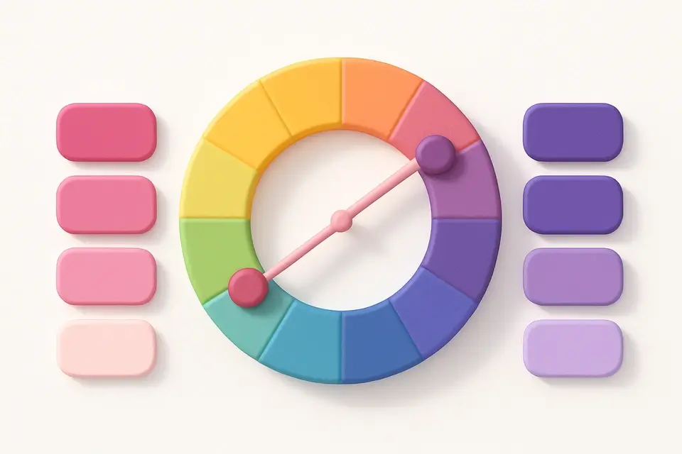
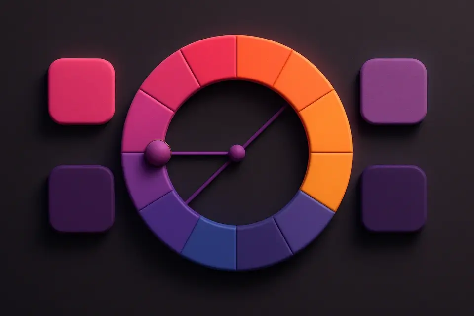
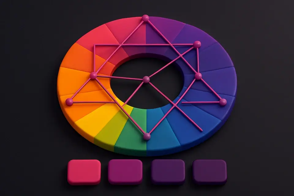
What Is Complementary Color Generator?
A complementary color generator finds the color directly opposite your base color on the color wheel — 180 degrees apart — and generates a palette with light and dark variations of both. Complementary colors create the strongest visual contrast and make each other appear more vibrant when placed side by side. This phenomenon, known as simultaneous contrast, has been used by artists since the Impressionists. The generator produces six colors: three variations of your base color and three of its complement, giving you a complete palette for high-impact designs. Complementary schemes are widely used in sports branding, call-to-action buttons (contrasting with the page color), data visualization (distinguishing two categories), and any design that needs strong visual impact.
Why Use Complementary Color Generator?
-
Automatic calculation of the exact complementary hue (180° opposite)
-
Light and dark variations of both base and complement colors
-
Maximum contrast for high-impact, attention-grabbing designs
-
Visual palette strip shows all colors working together
-
One-click copy for individual colors or full palette
Common Use Cases
Brand Design
Create high-contrast brand palettes using complementary colors for logo, text, and accent elements.
UI Call-to-Actions
Use complementary colors for buttons that need to stand out against the page background.
Data Visualization
Distinguish two data categories with maximum visual separation using complementary pairs.
Sports & Event Branding
Design energetic, bold color schemes that capture attention from a distance.
Technical Guide
Complementary colors are calculated by adding 180° to the base hue in HSL color space. If the base hue is 217° (blue), the complement is 37° (orange). The algorithm generates variations by adjusting lightness: +15% for lighter and -15% for darker versions, clamped to stay within the valid 0-100% range. These pairs achieve maximum contrast because they stimulate opposite cone cells in human vision — red/green, blue/orange, yellow/purple. In color theory, complementary pairs are also called "opponent colors." When mixed in equal amounts, they produce neutral gray (in paint/subtractive mixing) or white (in light/additive mixing). The high contrast makes complementary schemes excellent for accessibility, though the vibrating effect when placed directly adjacent can cause visual discomfort — use neutral colors as buffers.
Tips & Best Practices
-
1Use complementary colors for elements that need maximum contrast, like CTAs on a colored background
-
2Avoid using complementary colors at equal saturation for large text areas — the vibrating effect causes eye strain
-
3Use one color as dominant (60%) and the complement as accent (10%), with neutrals for the rest (30%)
-
4Complementary palettes naturally create warm/cool contrast, adding visual depth to designs
-
5Desaturate one of the pair slightly to reduce visual tension while maintaining contrast
Related Tools
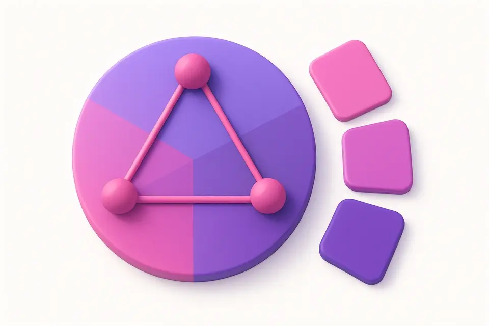
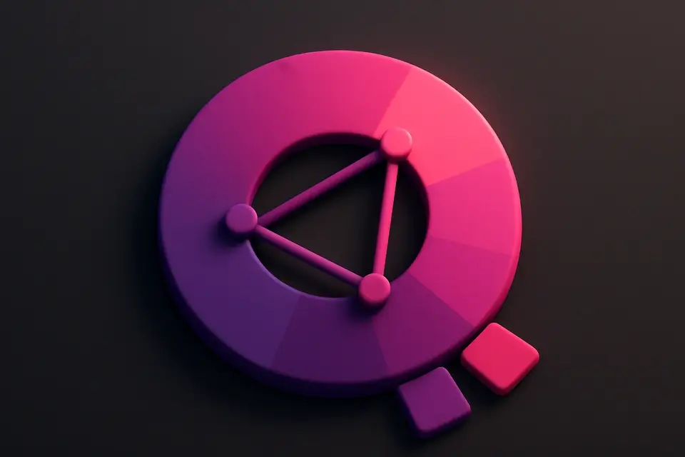
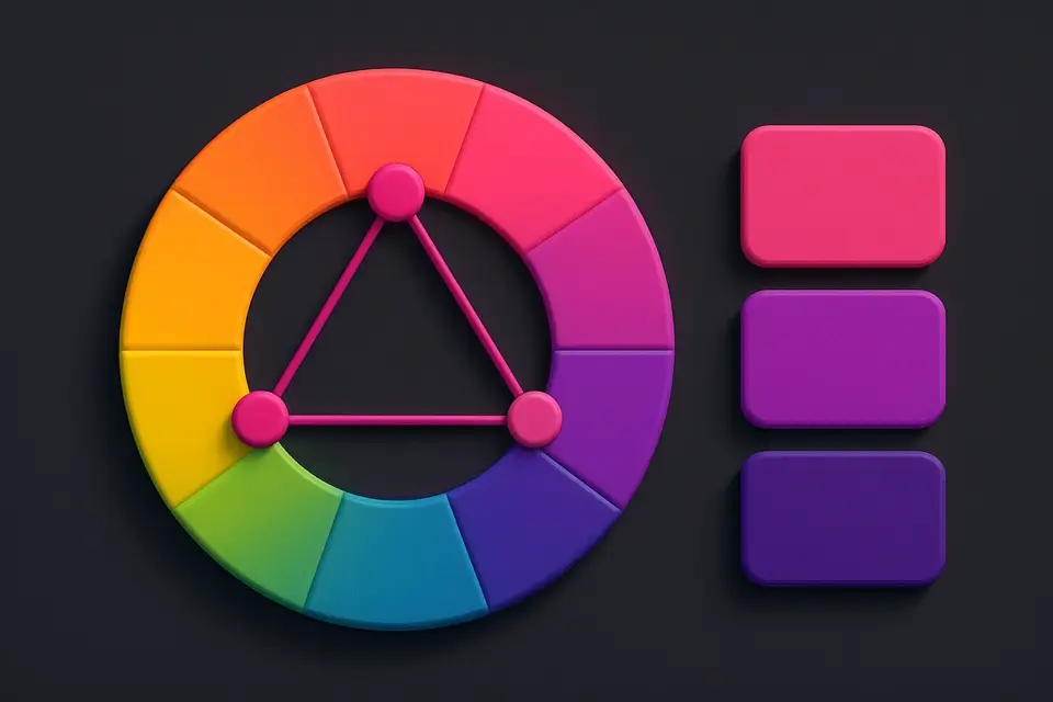
Triadic Color Scheme
Generate triadic color schemes with three colors 120° apart on the wheel.
🎨 Color Tools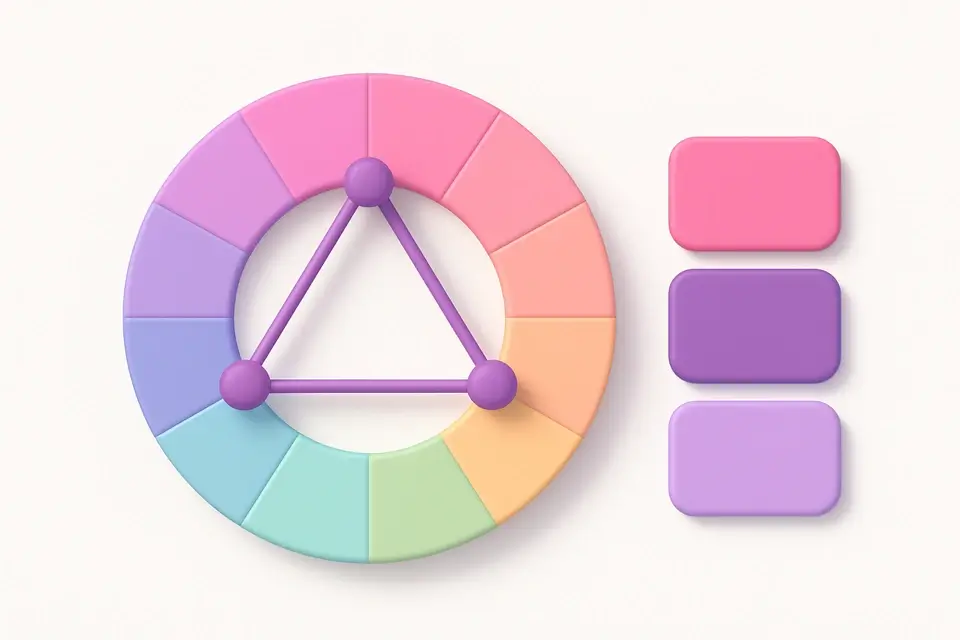
Split-Complementary Scheme
Generate split-complementary palettes with adjustable split angle.
🎨 Color Tools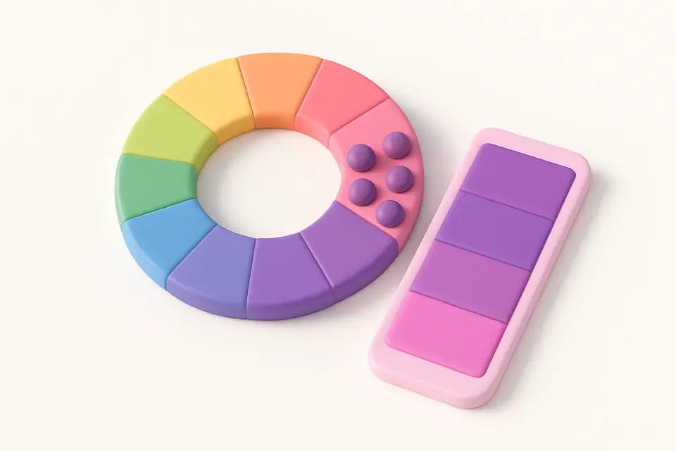
Analogous Color Scheme
Generate analogous color palettes with adjustable angle and count.
🎨 Color Tools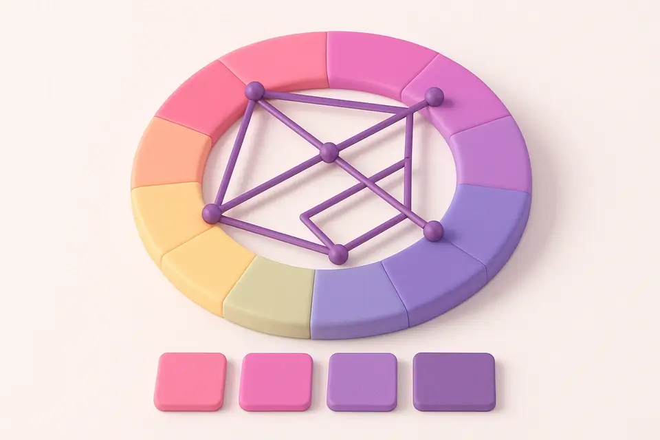
Color Harmony Wheel
Interactive color wheel with five harmony types and visual selection.
🎨 Color Tools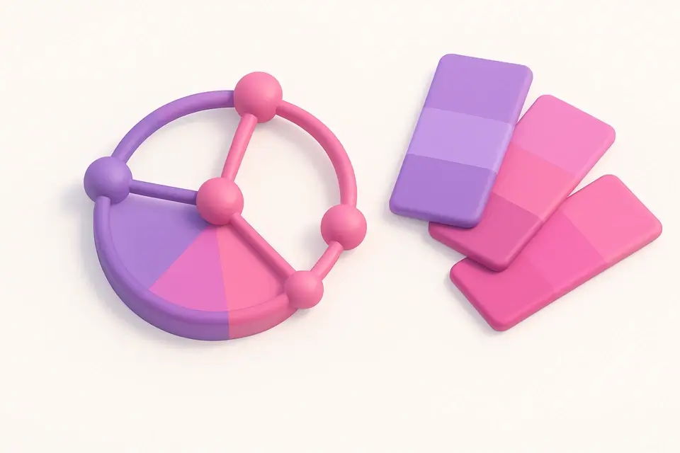

Tetradic Color Scheme
Generate tetradic (rectangular) color schemes with four colors 90° apart.
🎨 Color ToolsFrequently Asked Questions
Q What are complementary colors?
Q Why do complementary colors look so vibrant together?
Q Can complementary colors be used for text on background?
About This Tool
Complementary Color Generator is a free online tool by FreeToolkit.ai. All processing happens directly in your browser — your data never leaves your device. No registration or installation required.