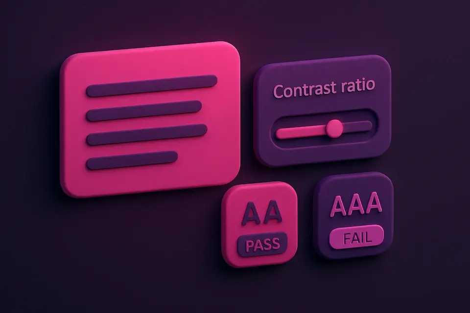
Build an Accessible Color Palette for Any Background Generate color palettes that meet WCAG contrast requirements.
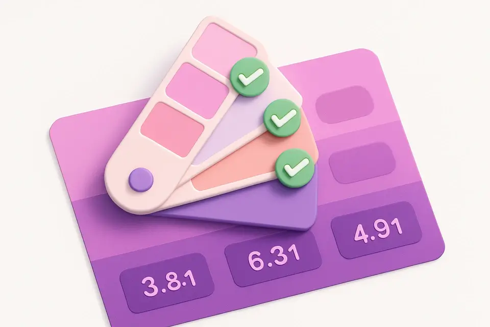

Accessible Palette Generator
Generate color palettes that meet WCAG contrast requirements.
Set Background
Enter your background color.
Choose WCAG Level
Select AA (4.5:1) or AAA (7:1) compliance target.
Browse & Copy
See accessible colors with their contrast ratios and copy them.
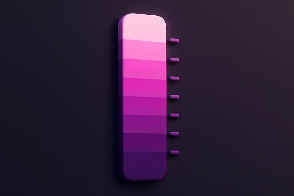
What Is Accessible Palette Generator?
An accessible palette generator finds colors that meet WCAG contrast requirements against your chosen background color. Instead of manually testing individual colors, this tool scans the color spectrum and presents only colors that achieve your target contrast ratio (AA at 4.5:1 or AAA at 7:1). Each color is shown with a live text preview against your background and its exact contrast ratio, making it easy to find accessible colors that also fit your design aesthetic. This solves one of the most common challenges in accessible design: finding colors that are both visually appealing and compliant with accessibility standards.
Why Use Accessible Palette Generator?
-
Automatically finds colors that pass WCAG contrast requirements
-
Choose between AA (4.5:1) and AAA (7:1) compliance levels
-
Live text preview on your background color
-
Shows exact contrast ratio for each suggested color
-
Saves hours of manual contrast checking
Common Use Cases
Accessible Web Design
Build color palettes guaranteed to meet WCAG requirements from the start.
Design System Creation
Generate accessible text colors for each background color in your system.
Client Projects
Present clients with color options that are pre-verified for accessibility.
Remediation
Find accessible alternatives when existing colors fail contrast checks.
Technical Guide
The generator iterates through hue angles (0-360° at 30° intervals) and lightness levels (10-90% at 10% intervals) with a fixed saturation of 70%. For each generated color, it calculates the WCAG contrast ratio against the specified background using the relative luminance formula. Colors meeting the minimum ratio threshold are collected, sorted by contrast ratio (highest first), and presented to the user. Higher contrast ratios indicate better readability. The minimum thresholds are based on WCAG 2.1 Success Criteria 1.4.3 (AA) and 1.4.6 (AAA).
Tips & Best Practices
-
1Start with your background color and find accessible text colors — not the other way around
-
2For dark backgrounds, accessible colors tend to be lighter; for light backgrounds, darker
-
3Higher contrast ratios are always better — aim higher than the minimum when possible
-
4Remember to test accessible colors with color blindness simulation too
-
5Keep your accessible palette small (4-6 colors) for consistency
Related Tools
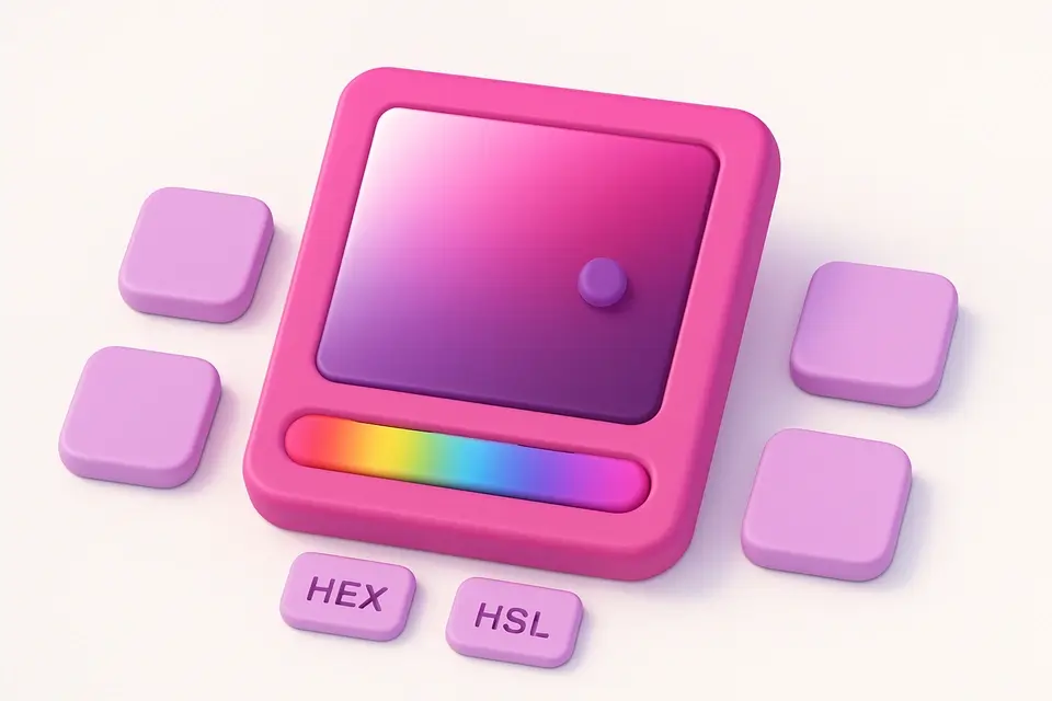
Color Picker
Interactive color picker with HEX, RGB, HSL, and CMYK outputs.
🎨 Color Tools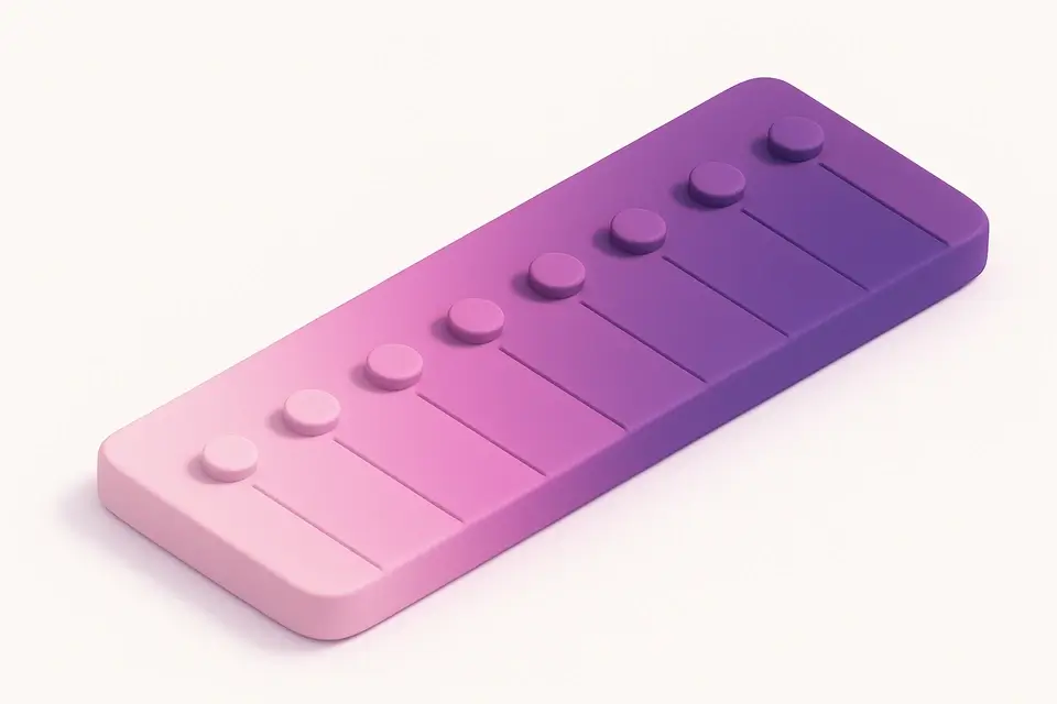
Monochromatic Palette Generator
Generate a monochromatic color palette from any base color.
🎨 Color Tools
Color Shade Generator
Generate darker shades of any color with adjustable step count.
🎨 Color Tools
Contrast Ratio Checker
Check WCAG contrast ratios between foreground and background colors.
🎨 Color Tools
Color Blindness Simulator
Simulate how colors appear to people with different types of color vision deficiency.
🎨 Color ToolsFrequently Asked Questions
Q What makes a color accessible?
Q Why are some hues missing from results?
Q Is AAA compliance always necessary?
About This Tool
Accessible Palette Generator is a free online tool by FreeToolkit.ai. All processing happens directly in your browser — your data never leaves your device. No registration or installation required.