Color Blindness Simulator Simulate how colors appear to people with different types of color vision deficiency.
Color Blindness Simulator
Simulate how colors appear to people with different types of color vision deficiency.
Enter Colors
Input two colors you want to test together.
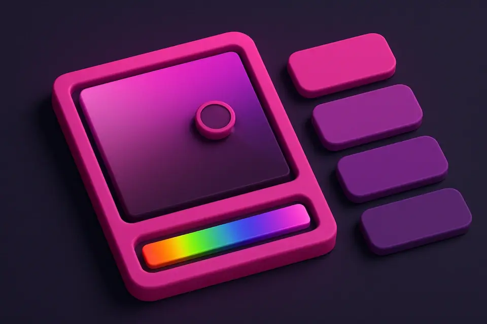
View Simulations
See how both colors appear under four types of color vision deficiency.
Assess Accessibility
Determine if your color combination is distinguishable for all users.
What Is Color Blindness Simulator?
A color blindness simulator shows how your color choices appear to people with different types of color vision deficiency (CVD). Approximately 8% of men and 0.5% of women have some form of color blindness. This tool simulates four types: Protanopia (red-cone absence, ~1% of males), Deuteranopia (green-cone absence, ~1% of males), Tritanopia (blue-cone absence, ~0.01%), and Achromatopsia (complete color blindness, ~0.003%). For each type, the simulator transforms your input colors to show how they would appear to someone with that condition. This is essential for making sure your designs are inclusive and that color is never the only means of conveying information. By testing with this simulator early in the design process, you can identify and fix accessibility issues before they reach users.
Why Use Color Blindness Simulator?
-
Simulates four major types of color vision deficiency
-
Side-by-side comparison of two colors under each condition
-
Shows prevalence statistics for each type
-
Helps ensure designs are inclusive for all users
-
Quick way to test color accessibility before deployment
Common Use Cases
UI Accessibility
Test button colors, status indicators, and interactive elements for color-blind users.
Data Visualization
Verify chart colors are distinguishable across all vision types.
Traffic & Safety
Ensure warning colors and status indicators work for color-blind operators.
Education Materials
Design learning materials that are accessible to students with CVD.
Technical Guide
The simulator applies transformation matrices to RGB values that approximate the color perception of each CVD type. Protanopia simulation replaces the L-cone (long-wavelength, red) response with a combination of M and S cone responses. Deuteranopia replaces the M-cone (medium-wavelength, green) response. Tritanopia replaces the S-cone (short-wavelength, blue) response. Achromatopsia converts to grayscale using the standard luminance formula (0.299R + 0.587G + 0.114B). These are simplified linear transformations that approximate the Brettel-Viénot-Mollon simulation model. More accurate simulations would use full spectral rendering with cone response functions, but the matrix approach provides a computationally efficient approximation suitable for real-time web tools. The key insight for designers: if two colors become indistinguishable under any simulation, they should not be the sole differentiator for important information.
Tips & Best Practices
-
1Never use color as the ONLY way to convey information — add text labels, icons, or patterns
-
2Red-green color blindness is the most common — test reds vs. greens carefully
-
3Blue-yellow combinations are generally safe for most color vision types
-
4If colors merge under simulation, add contrast (different lightness) or non-color cues
-
5Test your most critical color combinations (error/success, enabled/disabled, links/text)
Related Tools
HEX to RGB Converter
Convert HEX color codes to RGB values instantly with a live preview swatch.
🎨 Color Tools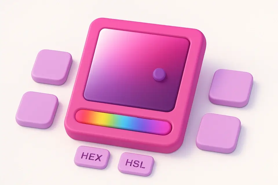
Color Picker
Interactive color picker with HEX, RGB, HSL, and CMYK outputs.
🎨 Color Tools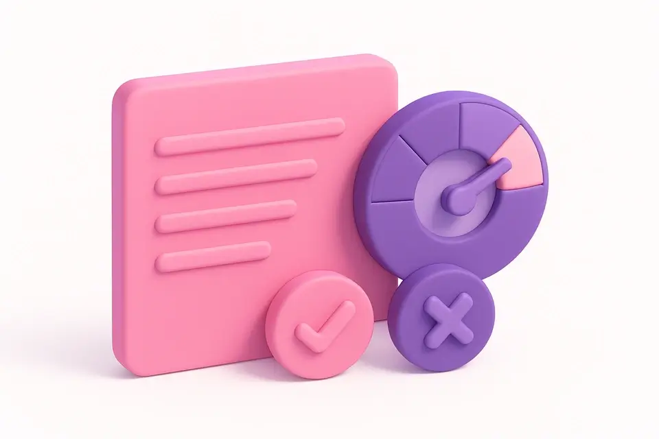
Contrast Ratio Checker
Check WCAG contrast ratios between foreground and background colors.
🎨 Color Tools
Accessible Palette Generator
Generate color palettes that meet WCAG contrast requirements.
🎨 Color Tools
Color Space Visualizer
Visualize any color across HEX, RGB, HSL, HSV, and CMYK with bar charts.
🎨 Color ToolsFrequently Asked Questions
Q How common is color blindness?
Q Is this simulation accurate?
Q What colors are safe for color-blind users?
Q Can I use red and green for color-blind users?
About This Tool
Color Blindness Simulator is a free online tool by FreeToolkit.ai. All processing happens directly in your browser — your data never leaves your device. No registration or installation required.