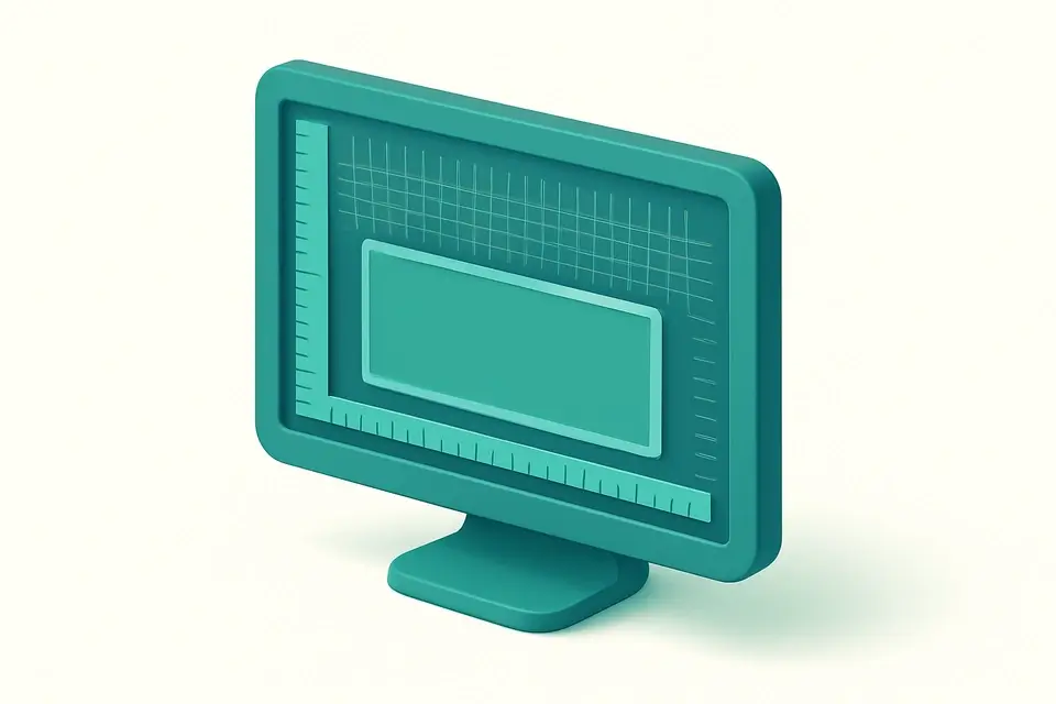
Detect Your Screen Resolution & Display Size What Is My Screen Resolution tool for network operations.
What Is My Screen Resolution
What Is My Screen Resolution tool for network operations.
Open the Resolution Detector
Navigate to the tool page to begin automatic screen detection.
Review Your Display Details
View your detected screen width, height, and pixel ratio.
Copy Your Resolution Data
Copy the detected values for use in development or design.
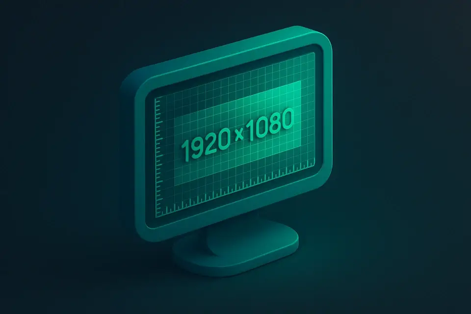
What Is What Is My Screen Resolution?
What Is My Screen Resolution is a web-based tool that instantly provides detailed information about your screen resolution, including the number of CSS pixels, physical pixels, device pixel ratio, and aspect ratio. Developers and network engineers use it to troubleshoot display issues or optimize their applications for various screen sizes. One specific problem it solves is helping users determine the correct image asset density by calculating physical pixels based on CSS pixels and the device pixel ratio.
It runs entirely in your browser, with no data sent to any server, ensuring instant results without compromising security. The tool's mobile-friendly interface makes it accessible on a range of devices, allowing users to check their screen resolution anywhere. What sets this apart from other screen resolution checkers is its ability to update viewport dimensions live as you resize the window, indicated by a green dot next to the relevant fields.
The tool provides detailed information, including available screen size, window size, color depth, and pixel depth, making it a useful resource for anyone looking to find their screen resolution or understand how to optimize their display settings. By using modern browser APIs and pure JavaScript, it can provide accurate results without requiring any additional software or plugins, making it a convenient option for those who want to check my screen resolution or determine what is my display resolution.
Why Use What Is My Screen Resolution?
-
Instant results
-
100% client-side
-
Mobile-friendly
-
No signup required
Common Use Cases
Development
Web dev and debugging.
Networking
Network config.
Education
Learn concepts.
Security
Security analysis.
Technical Guide
The tool uses the `useState` and `useEffect` React hooks to manage its state and handle side effects, such as updating the screen resolution data when the window is resized. It also utilizes the `useCallback` hook to memoize functions like `updateData` and `handleCopy`, which helps prevent unnecessary re-renders. Under the hood, it employs browser APIs like `screen.width` and `screen.height` to fetch the current screen resolution, as well as `window.devicePixelRatio` to determine the device's pixel density. The `gcd` function calculates the greatest common divisor of two numbers, which is used to compute the aspect ratio of the screen.
When the tool updates its data, it uses the `updateData` function, which fetches the latest values from the browser APIs and recalculates derived properties like effective width and height. This process involves multiplying the CSS pixels by the device pixel ratio, resulting in physical pixels that can be used to select suitable image assets. The `formatOrientation` function is responsible for formatting the screen orientation string, replacing hyphens with spaces and capitalizing the first letter of each word. The tool also uses the `copyToClipboard` utility from the `@/lib/utils` module to copy the formatted screen resolution data to the clipboard when the user clicks the "Copy Screen Info" button.
The tool's UI is built using React components, which are rendered conditionally based on the availability of the screen resolution data. If no data is available, it displays a loading message; otherwise, it shows a detailed breakdown of the screen resolution, including CSS pixels, physical pixels, device pixel ratio, and aspect ratio. The viewport dimensions update live as the user resizes the window, indicated by a green dot next to the relevant fields. This live updating is achieved through the `window.addEventListener` method, which attaches an event listener to the window's resize event and calls the `updateData` function whenever the window size changes.
Tips & Best Practices
-
1Detect changes in viewport dimensions by looking for the green dot indicator
-
2Copy screen info to clipboard by clicking the '⧉ Copy Screen Info' button
-
3Update screen data live by resizing the window
-
4Calculate physical pixels by multiplying CSS pixels with the device pixel ratio
-
5Refresh screen info manually by clicking the '↻ Refresh' button
-
6Check for orientation changes in the 'Orientation' field
Related Tools
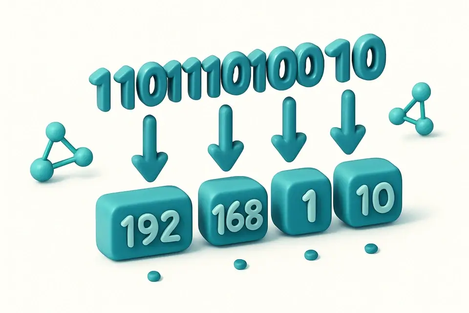
Binary to IP
Binary to IP tool for network operations.
🌐 Network & Web

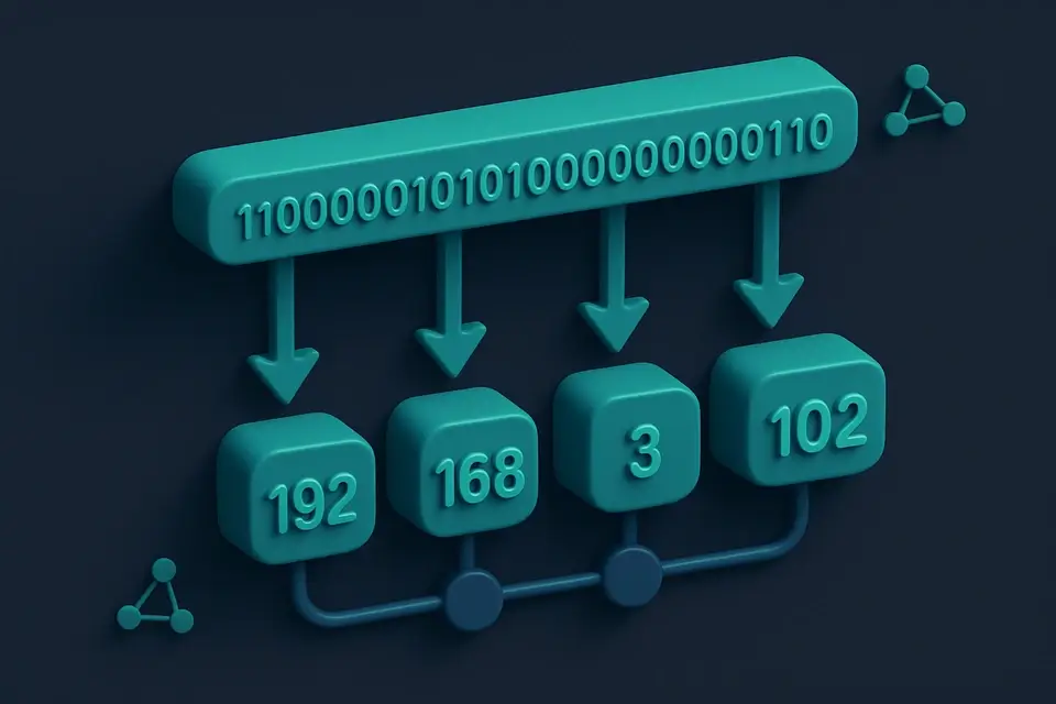
IP to Binary
IP to Binary tool for network operations.
🌐 Network & Web
Data URI Generator
Data URI Generator tool for network operations.
🌐 Network & Web

User Agent Parser
User Agent Parser tool for network operations.
🌐 Network & WebFrequently Asked Questions
Q Is this screen resolution tool free to use?
Q Is it safe to check my screen resolution online?
Q Can I check my screen resolution on mobile?
Q Does this screen resolution tool work offline?
Q Which browsers support this tool?
About This Tool
What Is My Screen Resolution is a free online tool by FreeToolkit.ai. All processing happens directly in your browser — your data never leaves your device. No registration or installation required.