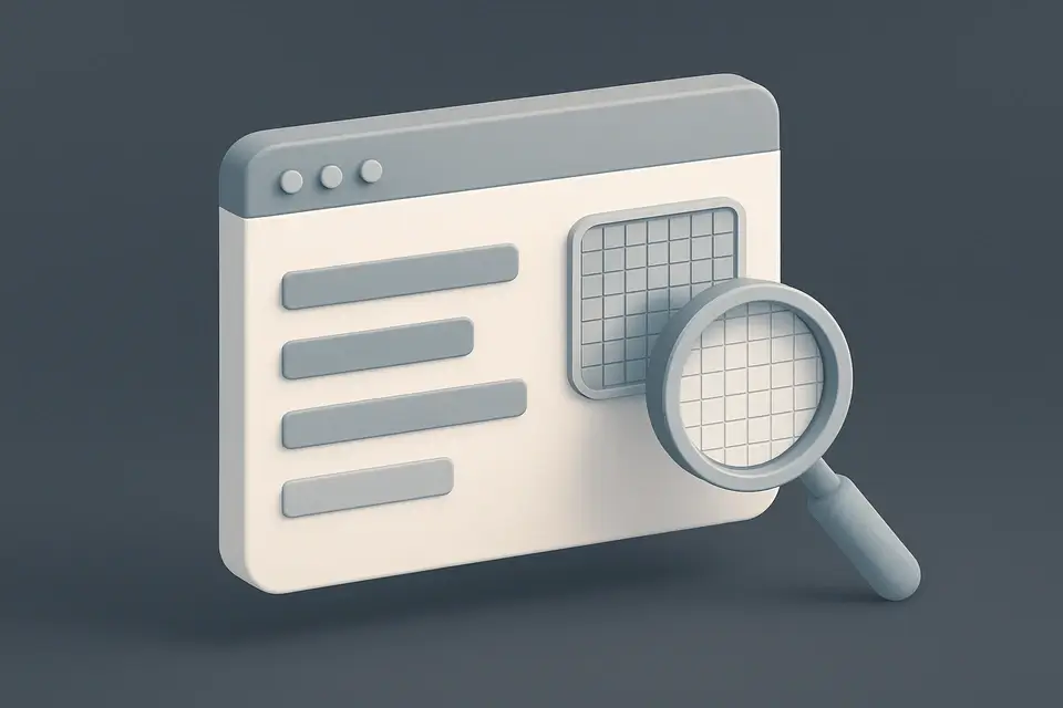
Screen Resolution Display View your current screen resolution, viewport size, device pixel ratio, and display information.
Screen Resolution Display
View your current screen resolution, viewport size, device pixel ratio, and display information.
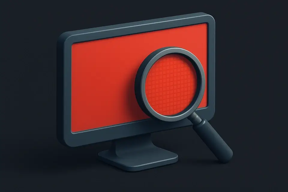
Open the Screen Checker
Instantly see your screen info.
Review Your Display Metrics
Resolution, viewport, pixel ratio, color depth, orientation.
Resize Your Browser
Resize browser to see real-time updates.
What Is Screen Resolution Display?
A Screen Resolution Display is a tool that shows detailed information about a device's display settings, including screen resolution, viewport dimensions, and device pixel ratio. Developers and designers use it to test responsive designs and troubleshoot display-related issues, such as identifying the correct screen size checker for their application. One specific problem it solves is providing accurate information about the current screen resolution, which can be useful when checking screen resolution online or troubleshooting display issues.
The tool updates its values in real-time when the user resizes the window or rotates their device, allowing for precise testing of different orientations and screen sizes. What makes this tool different is its ability to calculate and display additional information such as aspect ratio, physical pixels, and color depth, which are essential for understanding how a device's display will render content.
It also includes a viewport visualization feature that overlays the current viewport dimensions on top of the total screen size, giving users a clear understanding of their available screen space. This feature is particularly useful when checking what is my screen resolution and how it compares to the total screen size, making it an ideal tool for responsive design testing and tech support.
Why Use Screen Resolution Display?
-
Instant display info
-
Real-time updates
-
Pixel ratio detection
-
Color depth and orientation
-
Works on desktop, tablet, and mobile
Common Use Cases
Responsive Design
Debug breakpoints and media queries.
Tech Support
Communicate resolution for troubleshooting.
DPI-Aware Design
Check pixel ratio for Retina displays.
Technical Guide
The tool works by accessing various browser APIs to gather information about the device's display settings. It reads properties from the window.screen object, such as width and height, to determine the screen resolution. Additionally, it accesses properties from the window object, including innerWidth, innerHeight, and devicePixelRatio, to calculate the viewport dimensions and device pixel ratio. The screen.colorDepth property is used to retrieve the color depth of the display, while screen.orientation.type provides information about the current orientation.
The tool utilizes the React library, specifically the useState and useEffect hooks, to manage state and handle side effects. The useEffect hook is used with a resize listener to update the display settings in real-time when the user resizes the window or rotates their device. This allows for precise testing of different orientations and screen sizes. The gcd function, which calculates the greatest common divisor of two numbers, is used to determine the aspect ratio of the screen resolution.
The tool's data structure consists of a ScreenInfo interface, which defines properties such as screenWidth, screenHeight, viewportWidth, viewportHeight, devicePixelRatio, colorDepth, orientation, aspectRatio, physicalWidth, and physicalHeight. This interface provides a clear and organized way to store and access the display settings information. The use of TypeScript ensures that the code is type-safe and maintainable.
The viewport visualization feature uses CSS styles to overlay the current viewport dimensions on top of the total screen size, providing a clear understanding of the available screen space. The aspectRatio property is calculated using the gcd function and is displayed in the format "width:height". The physicalWidth and physicalHeight properties are calculated by multiplying the screenWidth and screenHeight with the devicePixelRatio, respectively.
The tool updates its values in real-time when the user resizes the window or rotates their device, allowing for precise testing of different orientations and screen sizes. This is achieved through the use of the resize event listener, which triggers the update function whenever the window is resized. The update function recalculates the display settings and updates the state accordingly.
The React library's JSX syntax is used to render the display settings information in a user-friendly format. The tool uses a combination of HTML elements, such as div and p, to structure the content, and CSS styles to control the layout and appearance. The glass-card class is used to apply a consistent design style to the components.
The tool's code is written in TypeScript, which provides type safety and maintainability features. The use of interfaces, such as ScreenInfo, ensures that the code is well-organized and easy to understand. The tool's functionality is achieved through a combination of React hooks, browser APIs, and CSS styles, making it a powerful and flexible solution for displaying device display settings information.
Tips & Best Practices
-
1DPR 2+ = Retina display
-
2Common breakpoints: 768, 1024, 1280
-
3Color depth 24 = 16.7M colors
Related Tools
Placeholder Image Generator
Generate customizable placeholder images with solid colors or gradients for mockups and prototyping.
🧰 Miscellaneous
Dead Pixel Tester
Test your screen for dead or stuck pixels by cycling through full-screen solid colors.
🧰 Miscellaneous
Fullscreen Clock
Display a beautiful full-screen digital or analog clock for presentations and ambient displays.
🧰 Miscellaneous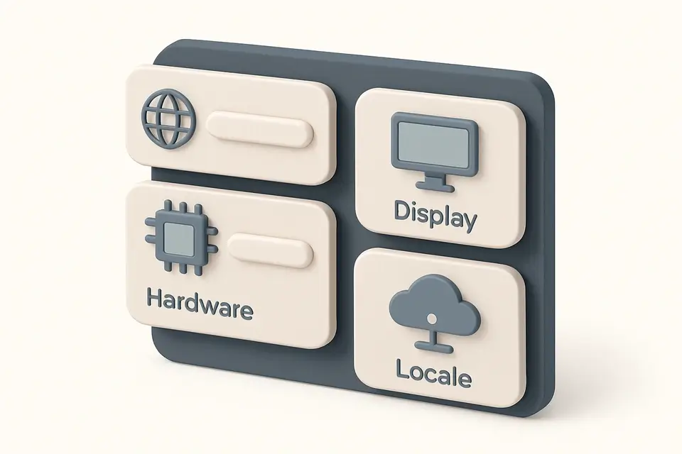
System Info Display
View detailed browser, device, and system information including hardware specs and network status.
🧰 MiscellaneousFrequently Asked Questions
About This Tool
Screen Resolution Display is a free online tool by FreeToolkit.ai. All processing happens directly in your browser — your data never leaves your device. No registration or installation required.