Browse All Material Design Colors & Shades Browse the complete Material Design color palette with all shades and accents.
Material Design Colors
Browse the complete Material Design color palette with all shades and accents.
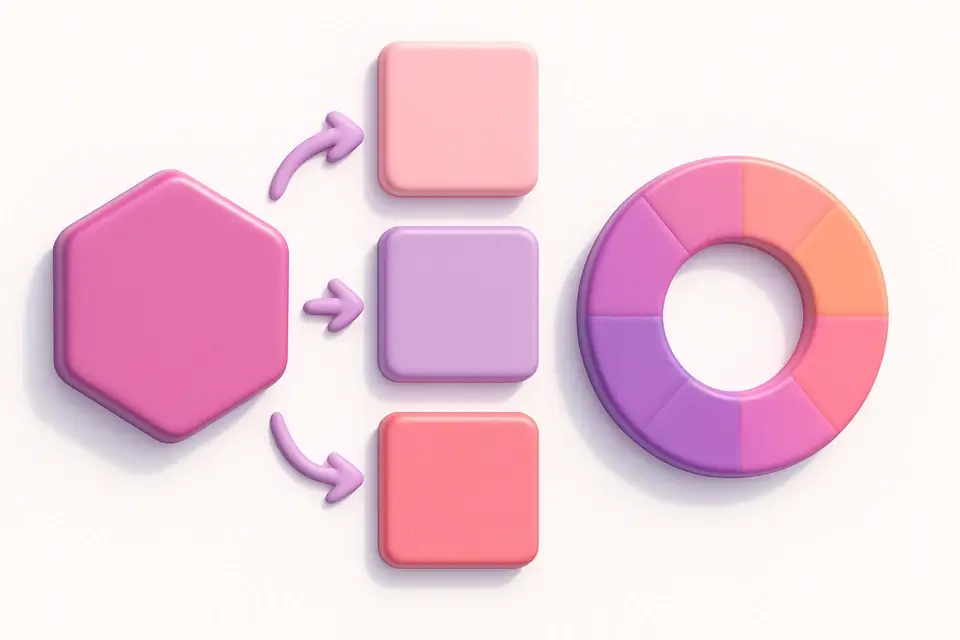
Select Family
Choose a color family like Red, Blue, or Teal.
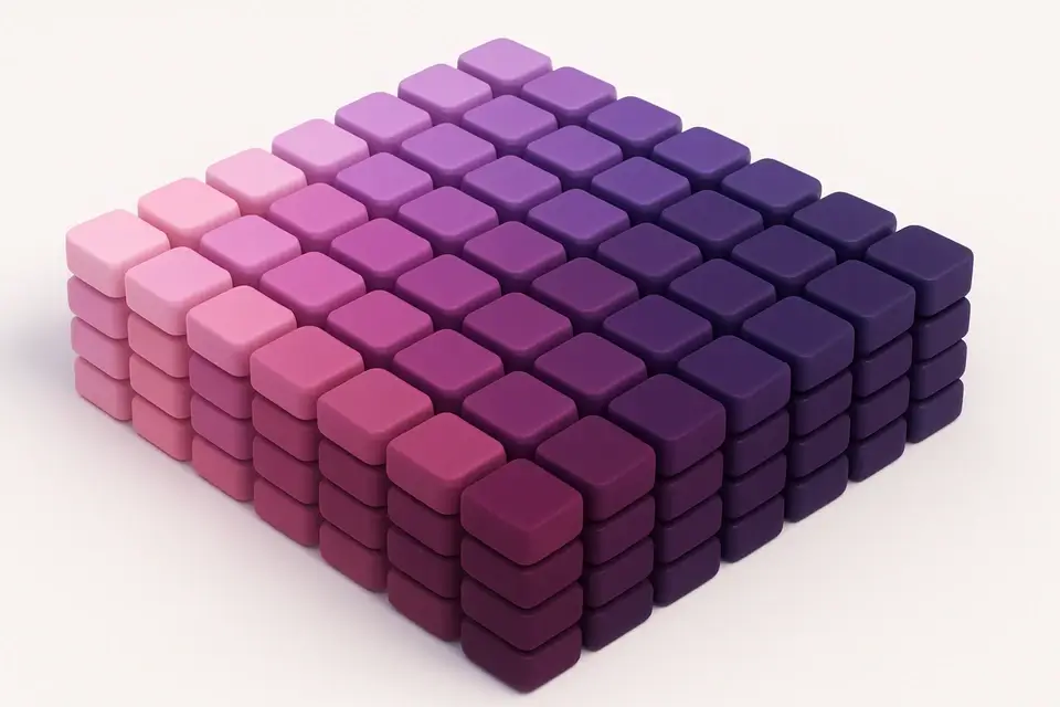
Browse Shades
See all shades from 50 (lightest) to 900 (darkest) plus accent variants.
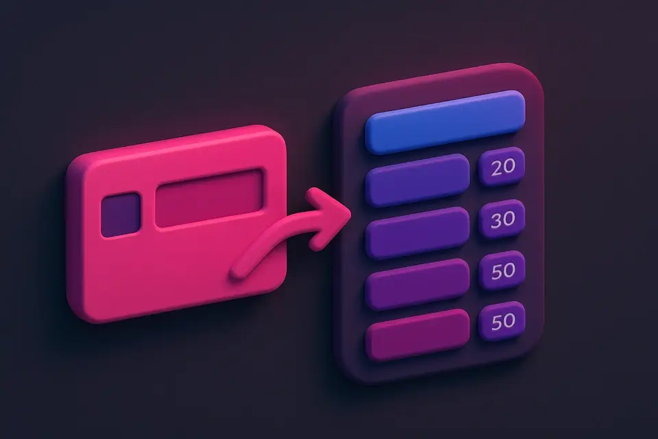
Copy Colors
Copy any shade's HEX code with one click.
What Is Material Design Colors?
Material Design Colors is a complete reference for Google's Material Design color system, featuring 19 color families with shades from 50 to 900 plus accent variants (A100–A700). The palette was carefully crafted by Google to provide a balanced, cohesive set of colors for user interface design. Each color family offers a range from very light (50) to very dark (900), with accent shades providing vivid, saturated variants for emphasis elements. The palette is designed with accessibility in mind, with clear contrast between adjacent shades. It is widely used in Android app development, Material UI (React), Angular Material, Flutter, and web applications following these design guidelines. The tool lets you browse by family, view all shades in a visual strip, and copy any color's HEX code.
Why Use Material Design Colors?
-
Complete Material Design palette with all 19 families
-
Shades 50-900 plus accent variants (A100-A700)
-
Visual color family selector with quick navigation
-
Shade strip showing all variants at a glance
-
One-click copy for every color
Common Use Cases
Android Development
Select Material colors for Android apps following Google's design guidelines.
Material UI (React)
Find exact color values for MUI theme customization.
Flutter Development
Choose Material colors for Flutter apps with confidence.
Web Design
Build Material Design-inspired websites with the official color palette.
Technical Guide
The Material Design color system uses a structured naming convention: Family Name + Shade Number. Each family has 10 standard shades (50, 100, 200...900) and up to 4 accent shades (A100, A200, A400, A700). The standard shades progress from very light (50, suitable for backgrounds) to very dark (900, suitable for text). The accent shades are highly saturated variants designed for floating action buttons, interactive elements, and emphasis. Not all families have accents — Brown, Grey, and Blue Grey lack accent variants because they are neutral. The colors were designed using the HCT (Hue, Chroma, Tone) color space in Material Design 3 (Material You), which provides more perceptually uniform color ramps than HSL. The palette ensures WCAG AA contrast between the 500 shade and white text, and between lighter shades and dark text.
Tips & Best Practices
-
1Shade 500 is the "primary" shade of each family — use it as your base
-
2Shades 50-200 work well for backgrounds and surfaces
-
3Shades 600-900 work well for text on light backgrounds
-
4Accent shades (A100-A700) are for emphasis elements like FABs and links
-
5Material Design 3 introduces dynamic color from user wallpapers — check Material You for updates
Related Tools
HEX to RGB Converter
Convert HEX color codes to RGB values instantly with a live preview swatch.
🎨 Color Tools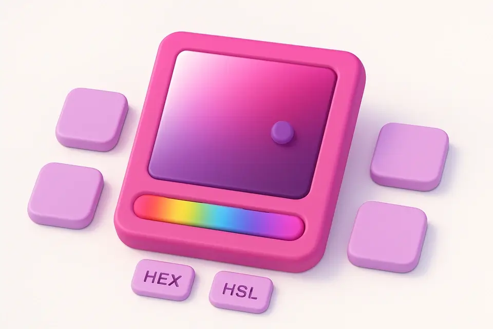
Color Picker
Interactive color picker with HEX, RGB, HSL, and CMYK outputs.
🎨 Color Tools
Brand Color Palettes
Browse official color palettes from 50+ popular brands and tech companies.
🎨 Color Tools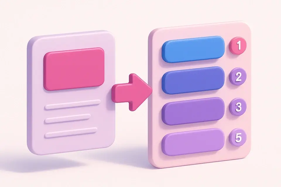
Tailwind Color Finder
Find the closest Tailwind CSS color class for any HEX code.
🎨 Color Tools
iOS & Android System Colors
Browse system colors for iOS Human Interface and Android Material Design.
🎨 Color ToolsFrequently Asked Questions
Q Is this the latest Material Design palette?
Q Why do Brown, Grey, and Blue Grey lack accent shades?
Q Which shade should I use for primary buttons?
About This Tool
Material Design Colors is a free online tool by FreeToolkit.ai. All processing happens directly in your browser — your data never leaves your device. No registration or installation required.