iOS & Android System Colors Browse system colors for iOS Human Interface and Android Material Design.
iOS & Android System Colors
Browse system colors for iOS Human Interface and Android Material Design.
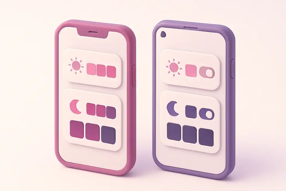
Choose Platform
Select iOS (Human Interface) or Android (Material 3).
Toggle Appearance
For iOS, switch between light and dark mode colors.
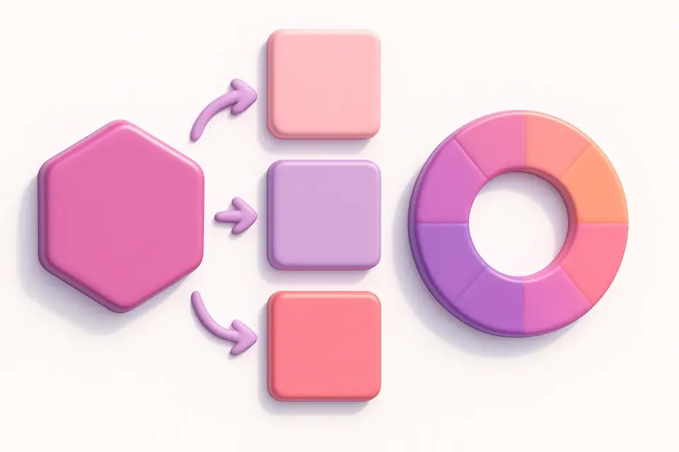
Copy Colors
Copy any system color's HEX code.
What Is iOS & Android System Colors?
This tool provides a complete reference for iOS and Android system colors — the predefined colors that Apple and Google recommend for building native applications. iOS system colors follow Apple's Human Interface Guidelines (HIG) and include semantically named colors like systemBlue, systemRed, and systemGray variants, each with separate light and dark mode values. Android colors follow Material Design 3 (Material You) design tokens including Primary, Secondary, Tertiary, Error, and Surface colors. Using these predefined palettes ensures your app feels native, adapts to appearance modes (light/dark), and maintains accessibility standards set by each platform. This reference saves developers from digging through documentation and ensures they use the exact color values specified by Apple and Google.
Why Use iOS & Android System Colors?
-
Complete iOS system colors with light and dark mode variants
-
Material 3 design tokens for Android development
-
Official platform colors for native app look and feel
-
Toggle between light and dark mode (iOS)
-
One-click copy for every color
Common Use Cases
iOS Development
Reference exact system color values for Swift/SwiftUI development.
Android Development
Find Material 3 color token values for Kotlin/Jetpack Compose.
Cross-Platform Design
Compare iOS and Android system colors when designing cross-platform apps.
Figma/Sketch Libraries
Set up design tool libraries with accurate platform system colors.
Technical Guide
iOS system colors are semantic colors that automatically adapt between light and dark appearances. For example, systemBlue is #007AFF in light mode and #0A84FF in dark mode — slightly brighter to maintain visual prominence against dark backgrounds. The color values are defined in Apple's UIKit (UIColor) and SwiftUI (Color) frameworks. Android Material 3 uses a token-based system: Primary, Secondary, Tertiary for key colors, Surface and Background for containers, and On-* variants for content on those surfaces. Material 3 tokens are designed to work with dynamic color generation from user wallpapers via the Material You system. Both platforms choose slightly different colors for dark mode to optimize for perceived brightness and contrast against their respective dark background colors.
Tips & Best Practices
-
1iOS system colors adapt automatically in code — use UIColor.systemBlue instead of hardcoded HEX
-
2Android Material 3 tokens should be used via MaterialTheme in Jetpack Compose
-
3Dark mode colors are slightly brighter than light mode to maintain visual weight on dark backgrounds
-
4Use semantic names (system colors) rather than hardcoded values for automatic dark mode support
-
5iOS has six gray levels (systemGray through systemGray6) for different hierarchy levels
Related Tools
HEX to RGB Converter
Convert HEX color codes to RGB values instantly with a live preview swatch.
🎨 Color Tools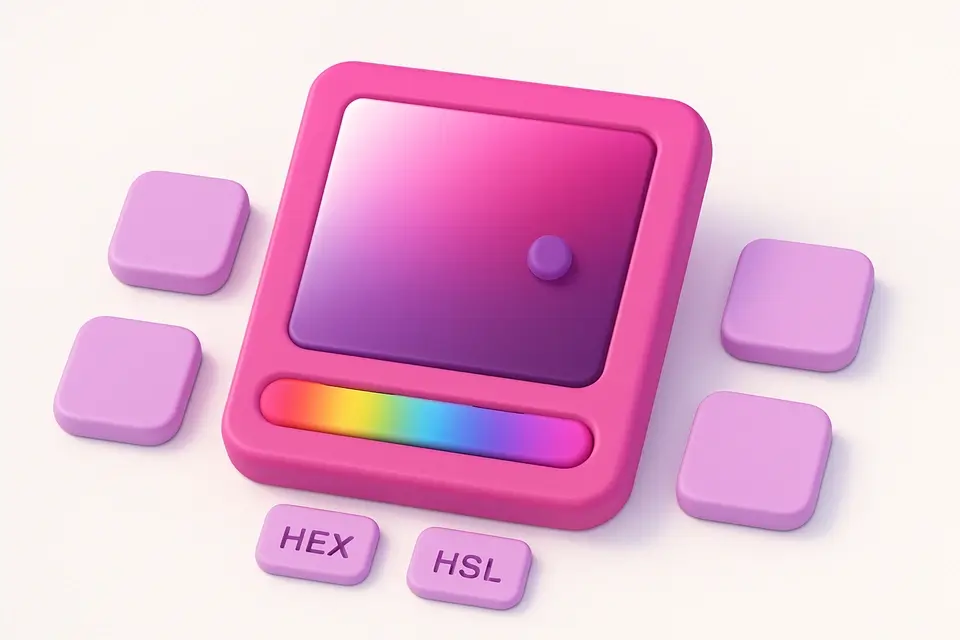
Color Picker
Interactive color picker with HEX, RGB, HSL, and CMYK outputs.
🎨 Color Tools
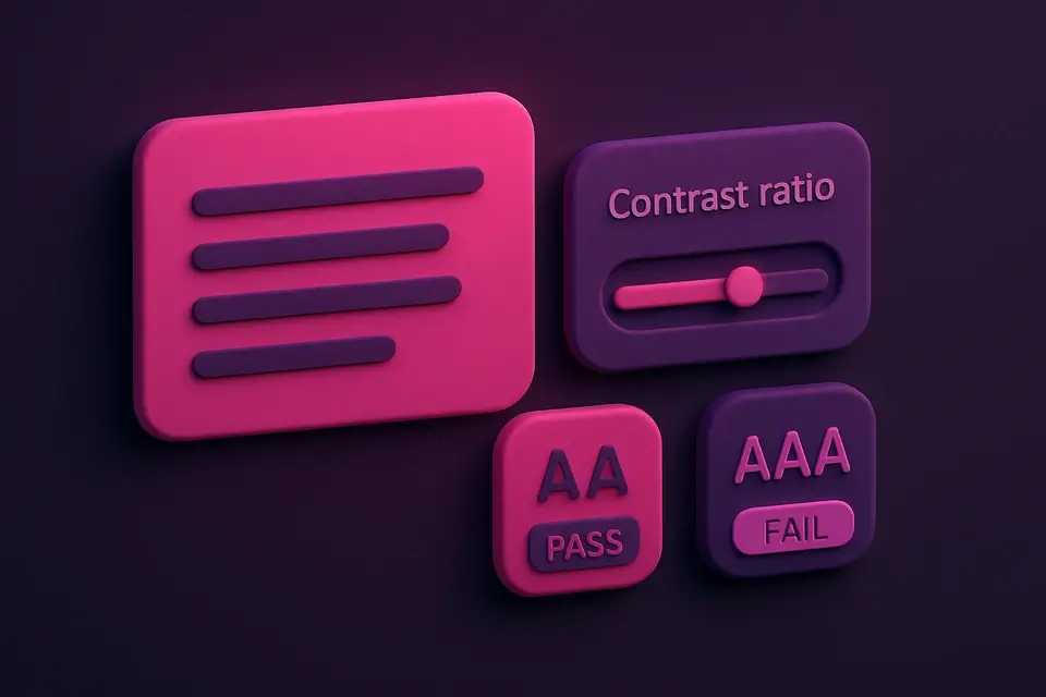
Contrast Ratio Checker
Check WCAG contrast ratios between foreground and background colors.
🎨 Color Tools
Brand Color Palettes
Browse official color palettes from 50+ popular brands and tech companies.
🎨 Color Tools
Material Design Colors
Browse the complete Material Design color palette with all shades and accents.
🎨 Color ToolsFrequently Asked Questions
Q Why are dark mode colors different from light mode?
Q Should I use these exact HEX values in native code?
Q Do these match the latest OS versions?
About This Tool
iOS & Android System Colors is a free online tool by FreeToolkit.ai. All processing happens directly in your browser — your data never leaves your device. No registration or installation required.