CSS Gradient Text Create text with gradient fill using CSS background-clip and text-fill-color.

CSS Gradient Text
Create text with gradient fill using CSS background-clip and text-fill-color.
Set gradient colors
Pick two or three colors for the text gradient and adjust the angle.
Customize typography
Set the font size and weight to match your design needs.
Copy the CSS
Preview the gradient text and copy the CSS with background-clip properties.
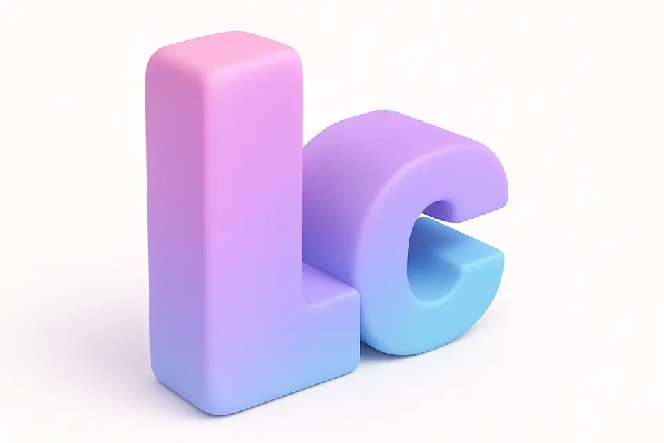
What Is CSS Gradient Text?
The CSS Gradient Text tool creates eye-catching text with gradient color fills. Instead of a solid text color, this technique applies a gradient background to the text using the background-clip: text property combined with -webkit-text-fill-color: transparent. This makes the gradient visible through the text characters. You can set two or three gradient colors, adjust the gradient angle, and customize the font size and weight. The tool generates all necessary CSS including webkit prefixes for maximum browser compatibility. Gradient text is popular for headings, hero sections, and brand elements where you want typography to stand out.
Why Use CSS Gradient Text?
-
Support for 2 or 3 color gradient stops
-
Adjustable gradient angle for any direction
-
Font size and weight controls for typography fine-tuning
-
Generated CSS includes all necessary webkit prefixes
Common Use Cases
Hero Headings
Create attention-grabbing hero section headings with gradient fills.
Brand Typography
Apply brand gradient colors to key text elements for visual identity.
Feature Titles
Highlight feature titles with colorful gradient text effects.
Landing Page CTAs
Make call-to-action text pop with vibrant gradient colors.
Technical Guide
The gradient text technique uses three CSS properties working together. First, background sets a linear-gradient on the text element. Second, -webkit-background-clip: text (and the standard background-clip: text) clips the background to the text content area only. Third, -webkit-text-fill-color: transparent (or color: transparent) makes the text color transparent so the gradient background shows through. The gradient can use any CSS gradient function including linear-gradient, radial-gradient, or conic-gradient. For the effect to work, the text element must have display: inline or inline-block. The webkit prefixes are required for Safari and older Chrome versions. For accessibility, ensure the gradient colors provide sufficient contrast against the background. Screen readers will still read the text normally regardless of the visual effect.
Tips & Best Practices
-
1Use bold, large text for the most impactful gradient effect
-
2Choose colors with good contrast between each other
-
3Add a third color for more complex, rainbow-like effects
-
4Test against your page background to ensure readability
Related Tools


CSS Gradient Generator
Create beautiful linear, radial, and conic CSS gradients with multiple color stops and angle control.
🎨 CSS & Design

CSS Text Shadow Generator
Create CSS text shadows with visual controls for offset, blur, color, and opacity.
🎨 CSS & Design
Typography Scale Generator
Generate a modular typographic scale with customizable base size, ratio, and units.
🎨 CSS & Design

CSS Triangle Generator
Generate CSS triangles using the border technique with direction and color controls.
🎨 CSS & DesignFrequently Asked Questions
Q Does gradient text work in all browsers?
Q Can I use more than two colors?
Q Is gradient text accessible?
Q Why does my gradient text show as a solid color?
Q Can I animate gradient text?
About This Tool
CSS Gradient Text is a free online tool by FreeToolkit.ai. All processing happens directly in your browser — your data never leaves your device. No registration or installation required.